
More pages don’t always mean more value on Etsy.
Sometimes, a simple Etsy digital product solves one clear problem better than a complicated bundle ever could.
The real question is not “How much can I include?”—it’s “How much does my buyer actually need?”
You can spend days building an Etsy digital product with dozens of pages, bonus files, extra features, and detailed instructions—only to discover that buyers seem more interested in something much simpler. That can make you wonder whether simple Etsy digital products are actually more appealing than the massive bundles you thought would provide more value.
The problem is that many Etsy sellers equate “more” with “better.” More templates. More pages. More options. More features. But every extra element has to serve a purpose. If buyers cannot quickly understand what a product does, who it is for, or how it will help them, the added complexity may create friction instead of value. And when simple Etsy digital products are easier to understand and use, they may give buyers a clearer reason to purchase.
This doesn’t mean every small product will sell or that complicated products are a bad idea. The real question is whether your product solves a specific problem well enough to justify what you’re asking the buyer to learn, choose, and use.
So what actually makes simple Etsy digital products compelling? The answer goes beyond product size. Buyer intent, usability, specificity, perceived value, and listing clarity can all influence how a product is understood before someone decides to buy.
Before creating another oversized bundle, it is worth examining what “simple” really means—and why simplicity can sometimes be a strategic advantage on Etsy.
Why Simple Etsy Digital Products Can Be More Valuable Than Complicated Ones
Simple Does Not Mean Low-Value
A simple product can still deliver substantial value when it solves a specific problem clearly and efficiently. The mistake is assuming that value is measured by page count, number of files, or how many features you can pack into a download.
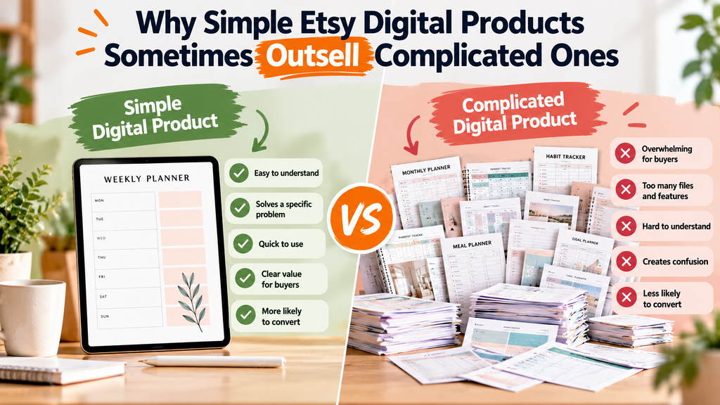
Consider two products: a 40-page planner with dozens of sections and a 10-page planner designed specifically for one recurring planning problem. The larger product may look more impressive, but the smaller one may be easier for the intended buyer to understand, use, and apply immediately. That distinction matters when developing simple Etsy digital products.
Etsy itself recommends that listing information clearly communicate what buyers are getting. Its current listing guidance also allows sellers to provide digital files and emphasizes clear descriptions and relevant buyer-facing information.
The goal, then, isn’t to make your product as small as possible. It’s to remove anything that doesn’t contribute to the buyer’s desired outcome.
How Specific Buyer Problems Create Stronger Product Ideas
Strong Etsy digital products usually begin with a buyer need rather than a format.
Instead of starting with, “What kind of printable should I create?” start with:
Who is the buyer, what problem are they facing, and what outcome do they want?
For example, “budget planner” is a broad concept. A printable designed specifically to help a particular buyer organize irregular monthly expenses is much more focused. The same principle can apply to templates, trackers, worksheets, checklists, invitations, and other digital products to sell on Etsy.
A useful product-development sequence is:
Buyer → Problem → Desired Outcome → Product → Features
This approach also helps prevent unnecessary features. Every page, field, template, or bonus should have a reason to exist.
This buyer-first approach becomes even more important when AI is involved. AI can generate polished product concepts quickly, but polished output does not automatically mean differentiated or useful. A recent discussion of AI-generated Etsy digital products highlights the difference between generic AI output and a finished product shaped around a specific buyer, use case, and purpose.
When More Features Add Value—and When They Add Friction
More features aren’t automatically bad. If an additional worksheet, customization option, or template genuinely helps the buyer accomplish the intended task, it can increase the product’s usefulness.
The problem starts when features are added mainly to make the product appear bigger.
Imagine a digital meal-planning product that includes a weekly planner, grocery list, recipe organizer, pantry tracker, meal-prep checklist, nutrition tracker, freezer inventory, restaurant log, and several unrelated bonus pages. That may sound valuable, but a buyer who simply wants an easy weekly meal plan could find the product unnecessarily complicated.
Complexity can also affect the listing experience. Etsy recommends clear, easy-to-scan titles and informative descriptions, while emphasizing that listing images should help shoppers understand what they’re considering.
A useful test is simple:
If removing a feature does not make the buyer’s intended outcome harder to achieve, question whether that feature belongs in the core product.
Etsy also recommends experimenting with a few digital designs, observing customer response, and expanding based on what performs well rather than assuming you need hundreds of products before learning what buyers respond to.
AI Prompt: Simplify an Etsy Digital Product Without Losing Its Value
Purpose: Use AI as a critical product editor to identify unnecessary complexity while protecting the product’s core buyer benefit.
Copy-and-Paste Prompt:
Act as an Etsy digital product strategist and buyer-focused product editor.

I am creating a digital product for Etsy and want to determine whether it is unnecessarily complicated. Your job is NOT to make the product smaller just for the sake of simplicity. Your job is to make it more focused, useful, and easier for the intended buyer to understand and use.

PRODUCT INFORMATION:
Product name: [INSERT PRODUCT NAME]
Product type: [PLANNER / TEMPLATE / WORKSHEET / CHECKLIST / JOURNAL / PRINTABLE / OTHER]
Target buyer: [DESCRIBE YOUR IDEAL BUYER]
Buyer problem: [DESCRIBE THE PROBLEM]
Desired outcome: [DESCRIBE WHAT THE BUYER WANTS TO ACHIEVE]
Current features/pages/files: [LIST EVERYTHING INCLUDED]
Main selling point: [DESCRIBE THE CURRENT VALUE PROPOSITION]

Analyze the product from the buyer's perspective.

Evaluate each feature as:
1. Essential — directly contributes to the primary buyer outcome.
2. Useful — adds meaningful value but is not essential.
3. Optional — may be useful for some buyers but is not necessary.
4. Unnecessary — adds complexity without meaningful additional value.

For every feature, explain your reasoning.

Then provide:
- The 3 most important elements to keep.
- The features that could be removed or moved into a bonus section.
- Any missing element that would genuinely improve usability.
- A simplified product structure.
- A clearer one-sentence value proposition.
- Three ways to make the product easier for a buyer to understand and use.

Do not assume that fewer pages automatically mean higher value.
Do not invent customer research, sales data, Etsy search volume, or conversion statistics.
Prioritize buyer intent, usability, clarity, and the product's actual desired outcome.
What Makes an Etsy Digital Product Worth Buying?
A buyer does not evaluate an Etsy digital product by counting how many pages, templates, or bonus files it contains. They are trying to answer a much simpler question: “Will this help me solve the problem I came here to solve?” That shift in perspective matters when deciding what to create and how much to include.
Etsy itself emphasizes that listing information should help shoppers understand what they are getting, while its current guidance on conversion focuses on whether shoppers find a listing appealing and whether it meets their expectations after they click.
Buyer Intent: Start With What the Customer Actually Needs
Before adding another feature, identify the buyer’s actual job-to-be-done.
Imagine someone searching for a printable weekly meal planner. They may want a simple way to organize meals and a grocery list. Giving them a 150-page lifestyle-planning bundle might sound more valuable from the seller’s perspective, but it does not automatically make the product more useful for that particular buyer.
This is where buyer intent becomes more important than product size.
Ask:
- What problem brought the buyer to Etsy?
- What outcome are they trying to achieve?
- What would make the product immediately useful?
- Which features directly support that outcome?
- Which features are included mainly to make the product look bigger?
A strong product starts with the buyer’s need and works backward. This approach can also help you identify more focused Etsy digital product ideas instead of creating broad products simply because they appear impressive.
Etsy’s guidance similarly encourages sellers to communicate clearly what an item is and what buyers will receive.
Usability, Clarity, and the Strength of the Product Outcome
A useful digital product should not require the buyer to figure out what to do with it.
Consider two hypothetical products:
Product A:
“Ultimate 200-Page Productivity Bundle” with planners, trackers, worksheets, calendars, goal-setting pages, habit tools, and several bonus files.
Product B:
“Weekly Focus Planner for Busy Freelancers” with a weekly planning page, priority section, and task tracker.
Product A contains more material. Product B communicates a much more specific use case.
That distinction matters because digital products are often purchased for convenience. Etsy’s Seller Handbook notes that digital downloads can give buyers immediate access to files, but sellers also need to make it clear what customers are buying and may need to address practical questions about downloading, opening, or using those files.
Clarity should exist at three levels:
- Listing clarity: The buyer understands what the product is.
- Product clarity: The buyer understands what each component does.
- Usage clarity: The buyer knows how to use the files after purchase.
When these three align, a smaller product can feel complete rather than incomplete.
Product Value vs. Page Count, Features, and File Quantity
One of the easiest mistakes for Etsy sellers is using quantity as a substitute for value.
A 100-page product is not automatically more valuable than a 10-page product. Ten carefully designed pages that solve one specific problem may be more useful to the right buyer than 100 pages that require sorting, learning, or customization.
Think of value as:
Specific problem + useful solution + easy implementation = perceived usefulness
That does not mean large bundles cannot work. They can make sense when buyers genuinely need multiple related resources. The important question is whether the additional material improves the customer’s outcome.
For example, a wedding-planning bundle may reasonably contain checklists, timelines, budget sheets, vendor trackers, and seating tools because those components support one broader job. But adding unrelated worksheets simply to increase the page count can weaken the product’s positioning.
The same principle applies to digital products to sell on Etsy: build around the customer’s desired outcome first, then determine how much content is actually necessary.
If your product is getting attention but buyers are not taking the next step, the issue may not be that you need more pages. It may be that the product’s value is not immediately clear. Etsy notes that clicks, favourites, and purchases are among the shopper interactions it considers when evaluating listing engagement.
A useful test is simple: Can you explain who the product is for, what problem it solves, and what the buyer can accomplish with it in one clear sentence?
If you cannot, adding more features probably is not the first problem to solve.
AI Prompt: Analyze an Etsy Digital Product From the Buyer’s Perspective
Purpose: Use AI to identify whether a digital product is focused on a meaningful buyer need or overloaded with features that may not contribute to its core value.
Copy-and-Paste Prompt:
Act as an Etsy product strategist and buyer-behavior analyst.

Analyze the following Etsy digital product from the perspective of its target US Etsy buyer.

PRODUCT INFORMATION:
Product name: [PRODUCT NAME]
Target buyer: [TARGET BUYER]
Main problem it claims to solve: [PROBLEM]
Desired buyer outcome: [OUTCOME]
Included files/features: [LIST ALL FILES AND FEATURES]
Current price: [PRICE]
Etsy listing description: [PASTE DESCRIPTION]

Evaluate the product using these criteria:

1. Identify the buyer's most likely primary need.
2. Identify the strongest outcome the product promises.
3. Separate essential features from optional features.
4. Identify features that may be unnecessary, confusing, or distracting.
5. Determine whether the product feels focused or overcomplicated.
6. Explain whether the number of pages/files/features appears justified by the buyer's problem.
7. Identify anything missing that could prevent the buyer from getting the promised outcome.
8. Explain how a buyer might perceive the product's value before purchasing.
9. Suggest a clearer product positioning statement.
10. Recommend whether I should simplify, keep, or expand the product—and explain why.

Do not assume that a larger product is more valuable.
Do not recommend adding features simply to increase page count.
Prioritize buyer intent, usefulness, clarity, usability, and the strength of the promised outcome.

Present the final analysis in this format:

PRIMARY BUYER NEED:
DESIRED OUTCOME:
WHAT ALREADY WORKS:
ESSENTIAL FEATURES:
OPTIONAL FEATURES:
POTENTIALLY UNNECESSARY FEATURES:
MISSING ELEMENTS:
COMPLEXITY RISK:
PERCEIVED VALUE:
RECOMMENDED PRODUCT POSITIONING:
TOP 3 CHANGES TO CONSIDER:
How to Choose Simple Digital Products to Sell on Etsy
Creating a digital product should start with the buyer’s problem, not with a list of features you want to include. A product can be beautifully designed and packed with useful resources, yet still be difficult to position if the buyer cannot immediately understand why they need it.
Etsy allows sellers to offer original digital designs as downloads, including premade files and made-to-order digital products. For digital listings, sellers can upload up to five files, while Etsy recommends clearly describing what the buyer will receive.
That makes product selection an important part of the selling process. Before creating another large bundle, use the following framework.
Find One Specific Problem Your Product Can Solve
Start with one question:
What specific problem will this product help an Etsy buyer solve?
For example, “a productivity planner” is broad. A more focused concept might be a weekly meal-planning printable for busy families. The second idea gives you a clearer buyer, use case, and expected outcome.
A strong product idea usually has four elements:
- Specific buyer: Who needs it?
- Specific problem: What are they struggling with?
- Specific solution: What does your product help them do?
- Specific outcome: What becomes easier after using it?
This is also where many sellers go wrong with Etsy digital product ideas. They start by asking, “What can I make?” A better question is, “What does my target buyer need help accomplishing?”
If you can explain the product in one straightforward sentence, that is often a useful sign that the concept is focused enough to develop.
Evaluate Demand, Relevance, and Buyer Expectations
A simple idea still needs a reason for someone to buy it. Before investing hours into design, evaluate whether the concept is relevant to the audience you want to reach.
Look at:
- Buyer relevance: Does the problem matter to a clearly defined Etsy customer?
- Search relevance: Are buyers likely to use words related to this problem when searching?
- Competitive context: Are there already products serving the need, and what can your version do differently?
- Usability: Can the buyer understand how to use the product without unnecessary explanation?
- Expectation match: Does the product deliver exactly what the listing promises?
Etsy’s listing guidance recommends using relevant information in titles and descriptions and choosing tags that reflect the keywords buyers might use when searching.
You can also use your existing shop data as a reality check. If one type of product consistently attracts more relevant engagement or buyer interest, that may give you a useful direction for developing related products.
And if you’re already getting attention but struggling to turn that interest into orders, it can be useful to examine the broader issue of why an Etsy digital product gets favorites but no orders rather than assuming the answer is simply “add more features.”
Build a Focused Product Instead of an Overloaded Bundle
Once you’ve identified a worthwhile problem, resist the temptation to keep adding material just to make the product look bigger.
Imagine you are creating a budgeting printable. You could create a 100-page financial bundle containing trackers, worksheets, calendars, challenges, savings charts, debt pages, and multiple versions—or create a focused 12-page budget system designed around one clear use case.
The larger product may be appropriate for some buyers. But the smaller product may be easier to understand, easier to preview, easier to explain in the listing, and easier for the buyer to start using.
The goal is not to make your product small. The goal is to make every component useful.
Before adding another page or bonus file, ask:
“Does this help the buyer achieve the primary outcome, or am I adding it simply to increase the product’s size?”
For simple Etsy digital products, this distinction is critical. Simplicity should remove unnecessary friction—not remove meaningful value.
AI Prompt: Validate an Etsy Digital Product Idea Before Creating It
Purpose: Use AI to pressure-test a product concept before spending significant time designing it. The goal is to identify the target buyer, core problem, value proposition, unnecessary complexity, and potential weaknesses.
Copy-and-Paste Prompt:
Act as an Etsy digital product strategist and buyer-focused product researcher.

I am considering creating this Etsy digital product:

[DESCRIBE YOUR PRODUCT IDEA]

Target buyer:
[DESCRIBE YOUR TARGET CUSTOMER]

My product's main purpose:
[DESCRIBE THE PROBLEM IT SHOULD SOLVE]

Evaluate this idea before I spend time creating it.

Analyze:

1. The most specific buyer problem this product could solve.
2. The clearest target customer for the product.
3. The primary outcome the buyer should get from using it.
4. Which parts of the product are essential.
5. Which features or components may be unnecessary.
6. Whether the concept is too broad, too complicated, or appropriately focused.
7. What questions or objections an Etsy buyer might have before purchasing.
8. What information I should clearly communicate in the Etsy listing.
9. Three ways I could make the product more useful without simply adding more pages or files.
10. Whether the product concept has a clear value proposition.

Do not assume that a larger product is more valuable.

Prioritize buyer usefulness, clarity, specificity, ease of use, and a clear outcome.

Do not invent sales numbers, search volume, Etsy ranking data, or market statistics.

Finish with:
- Core buyer problem:
- Target buyer:
- Primary outcome:
- Essential features:
- Unnecessary features:
- Recommended product scope:
- One-sentence value proposition:
- Biggest potential weakness:
- Recommended next step:
How Product Simplicity Can Improve Your Etsy Listing
A simple digital product becomes much easier to sell when the listing makes its value obvious within seconds. This matters because an Etsy buyer does not experience your product the same way you experience it as the creator. You may know every feature, bonus file, page, and customization option—but the buyer is seeing a thumbnail, title, price, and a few lines of information while deciding whether to click.
Etsy’s current guidance emphasizes that clear titles and strong first images can help shoppers understand what an item is and decide whether to explore it. Etsy also says that conversion-related signals can contribute to search visibility, making the listing experience important beyond simply getting a product indexed.
Make the Product’s Value Obvious in Your Etsy Title and Images
Your title and first image have one primary job: help the right buyer understand the product quickly.
For a digital product, this is especially important because buyers cannot physically inspect the item before purchasing. Your listing needs to communicate what the product is, who it is for, and what problem it helps solve.
For example, compare these two approaches:
Less clear:
“Ultimate Planner Bundle | 100+ Pages | Printable | Productivity | Organization”
More buyer-focused:
“Weekly Meal Planner Printable | Simple Grocery & Meal Planning”
The first listing may contain more material, but the second immediately communicates a specific use case.
This doesn’t mean every Etsy title should be extremely short or that longer products cannot sell. Etsy’s current guidance recommends clear, easy-to-scan titles that quickly describe what is being sold rather than stuffing titles with repeated phrases.
Your first image deserves the same treatment. Instead of trying to display every page or feature in one crowded graphic, show the product clearly and make its primary benefit easy to understand.
For example, if you’re selling a simple budget worksheet, the first image could show the actual worksheet in a clean, readable presentation. Additional images can explain what’s included, demonstrate how it works, and answer common buyer questions.
The goal is not to make a simple product look bigger than it is. The goal is to make its usefulness impossible to misunderstand.
Use Descriptions to Explain What Buyers Get and How It Helps
Once a shopper clicks your listing, the description should remove uncertainty.
A strong description answers practical questions such as:
- What exactly is included?
- Who is this product designed for?
- What problem does it help solve?
- What file formats are included?
- How does the buyer use the product?
- Is it editable or printable?
- What software or device is required?
- What is not included?
Etsy’s current guidance recommends putting essential information near the beginning of the description and explaining the product clearly rather than simply repeating keywords. Etsy also notes that keywords and phrases in descriptions can contribute to search matching.
This is where simple digital products for Etsy sellers can have an advantage: their value proposition can often be explained without a long list of complicated features.
Imagine you’re selling a one-page wedding budget spreadsheet. Instead of filling the description with generic claims about being “ultimate,” “complete,” or “all-in-one,” explain the specific outcome:
“This spreadsheet helps couples track their wedding budget, compare planned versus actual spending, and see where they are overspending.”
That tells the buyer what the product does and why it matters.
If your product is getting attention but not orders, the problem may not always be the product itself. Sometimes the listing does not communicate the product’s value clearly enough. This is particularly important when your Etsy digital product is intentionally simple.
For example, if buyers favorite a product but hesitate to purchase, you need to examine whether the listing answers the questions that stand between interest and confidence. A useful way to think about this is to move from “What did I create?” to “What does the buyer need to know before buying it?”
That buyer-centered approach also connects naturally with the broader problem of why an Etsy digital product gets favorites but no orders: attention and purchase confidence are not the same thing.
Align Your Listing With Buyer Expectations to Reduce Confusion
A buyer should receive essentially the same product they thought they were purchasing when they clicked your listing.
That sounds obvious, but complexity can make this harder.
Suppose your thumbnail suggests a simple printable habit tracker, while the actual product includes 47 pages, multiple versions, instructions, bonus worksheets, and several different tracking systems. The additional material may sound valuable from the seller’s perspective, but it can also make the product feel less focused.
The reverse can happen too. A seller may describe a product as a “complete business planner” when the download is actually a small collection of worksheets. That mismatch can create disappointment even if the worksheets themselves are useful.
Etsy recommends using listing information to give shoppers the details they need to make an informed purchasing decision, including clear images and descriptions.
Before publishing, ask yourself:
Can a buyer look at my listing and accurately predict what they will receive?
If the answer is yes, your simplicity is working for you.
If the answer is no, adding more features probably isn’t the solution. You may need to simplify the product promise, clarify the images, reorganize the description, or remove unnecessary elements.
This is also why digital downloads on Etsy should be presented around the buyer’s intended use rather than the creator’s production process. The buyer generally cares less about how many hours you spent making the file and more about whether the download solves the problem they came to Etsy to solve.
AI Prompt: Audit an Etsy Listing for Product Clarity and Buyer Confusion
Purpose: Use AI to identify whether your Etsy listing clearly communicates what the digital product is, who it is for, what the buyer receives, and whether unnecessary complexity could be creating confusion.
Copy-and-Paste Prompt:
Act as an experienced Etsy listing strategist and buyer-experience editor.

I sell digital products on Etsy. I want you to audit my listing specifically for product clarity, buyer understanding, and unnecessary complexity.

Here is my listing information:

Product name: [INSERT PRODUCT NAME]

Current Etsy title: [INSERT TITLE]

Product description: [INSERT DESCRIPTION]

What the buyer receives: [LIST ALL FILES, PAGES, TEMPLATES, BONUSES, OR FEATURES]

Target buyer: [DESCRIBE THE IDEAL BUYER]

Main problem the product solves: [DESCRIBE THE PROBLEM]

Primary buyer outcome: [DESCRIBE THE DESIRED OUTCOME]

Review the listing from the perspective of a US Etsy buyer who has never seen the product before.

Analyze:

1. Can the buyer understand what the product is within 5–10 seconds?
2. Is the primary benefit immediately clear?
3. Is the target buyer obvious?
4. Does the product appear more complicated than necessary?
5. Are any features, bonuses, or files likely to distract from the main value?
6. Does the title clearly describe what is being sold?
7. Does the description answer the most important pre-purchase questions?
8. Are there gaps between what the listing promises and what the buyer actually receives?
9. Are there places where the wording could create confusion or unrealistic expectations?
10. Does the listing communicate a clear value proposition without relying on exaggerated claims?

Then provide the output in this format:

A. Clarity Score: [1–10]
B. What the buyer understands immediately:
C. What may confuse the buyer:
D. Unnecessary complexity:
E. Missing information:
F. Strongest part of the listing:
G. Three specific improvements:
H. Revised core value proposition in one sentence:
I. Suggested improvements to the first listing image:
J. Suggested improvements to the Etsy title:
K. Suggested improvements to the opening of the description:

Do not invent customer data, sales results, Etsy ranking information, or conversion statistics.

Prioritize clarity, buyer intent, usability, and accurate product expectations over keyword stuffing.
When Simple Etsy Digital Products Should Become More Advanced
Simplicity can be a strategic advantage, but it should never become an excuse for leaving out something the buyer genuinely needs. Simple Etsy digital products should become more advanced when additional features directly improve the buyer’s ability to solve the problem, use the product, or achieve the promised outcome.
The key is to distinguish useful complexity from decorative complexity. A budgeting spreadsheet may need formulas, multiple tabs, and instructions because those features perform a real function. A social media template may benefit from several formats if buyers actually need them. But adding 40 extra pages, unrelated worksheets, or bonus files simply to make a product look bigger does not automatically increase its value.
Etsy itself recommends that sellers experiment with digital downloads, observe what customers respond to, and then create more of what performs well.
Recognize When Additional Features Actually Solve Buyer Needs
Before adding another feature, ask a simple question: What specific buyer problem does this feature solve?
A useful feature should make the product:
- Easier to use
- More practical
- More customizable when customization is genuinely needed
- More complete for its intended purpose
- More effective at delivering the promised outcome
For example, imagine you’re selling a printable meal-planning template. Adding a grocery-list page could make sense because it supports the same planning task. Adding unrelated pages for budgeting, habit tracking, and journaling may make the product larger but less focused.
This distinction matters because buyers need to understand what they’re getting. Etsy’s current listing guidance emphasizes clear, informative descriptions and images that help shoppers understand the product before purchasing.
A good rule is:
Add complexity when it increases usefulness—not merely when it increases file count.
Avoid Common Mistakes When Simplifying a Digital Product
Simplifying a product does not mean removing everything except the bare minimum. That can create a different problem: an underdeveloped product that doesn’t fully solve the buyer’s need.
Watch for these mistakes:
Removing essential instructions.
If buyers need guidance to use a template, planner, spreadsheet, or printable, those instructions are part of the product’s value.
Cutting useful variations.
If different formats genuinely serve different use cases, removing them simply to make the product smaller may reduce usability.
Confusing minimal design with minimal functionality.
A clean, simple-looking product can still contain sophisticated functionality behind the scenes.
Removing information buyers need before purchase.
For digital downloads, clarity about what the buyer receives is particularly important. Etsy notes that clear listing presentation can help prevent confusion about whether a shopper is purchasing a finished item or a digital pattern/download.
The goal is not to make your product as small as possible. It’s to make every component earn its place.
Use Buyer Feedback to Improve and Expand the Product Strategically
Your first version does not have to contain every feature a buyer might eventually want.
Instead, treat your initial product as a focused solution that can evolve. Pay attention to customer questions, reviews, messages, favorites, and purchasing behavior. Repeated questions can reveal unclear instructions. Repeated requests can reveal a genuinely useful feature. Positive feedback can show which part of the product buyers value most.
This creates a practical development cycle:
Create → Observe → Identify friction → Improve → Expand when justified.
Etsy specifically recommends learning and adapting over time when selling digital downloads, including starting with a few designs and using customer response to guide what you create next.
This approach can also reduce wasted effort. Instead of spending weeks building a huge digital product based entirely on assumptions, you can start with a focused version and let real customer feedback inform future improvements.
If buyers consistently ask for an editable version, additional size options, or a specific format, that feedback may justify expansion. If nobody uses a particular bonus section, its existence may not be contributing meaningful value.
AI Prompt: Prioritize Essential, Optional, and Unnecessary Product Features
Purpose: Use AI to evaluate a planned Etsy digital product and separate features that directly support the buyer’s outcome from features that may create unnecessary complexity.
Copy-and-Paste Prompt:
Act as an Etsy digital product strategist and buyer-experience analyst.

I am creating a digital product for Etsy and want to make sure it provides strong buyer value without becoming unnecessarily complicated.

Product idea:
[DESCRIBE YOUR PRODUCT]

Target buyer:
[DESCRIBE YOUR IDEAL ETSY BUYER]

Primary problem the product solves:
[DESCRIBE THE BUYER'S PROBLEM]

Desired buyer outcome:
[DESCRIBE WHAT THE BUYER SHOULD BE ABLE TO DO OR ACHIEVE]

Current features/components:
1. [FEATURE]
2. [FEATURE]
3. [FEATURE]
4. [FEATURE]
5. [FEATURE]
6. [FEATURE]
7. [FEATURE]

Analyze every feature and place it into one of these categories:

1. ESSENTIAL — directly necessary to solve the buyer's main problem
2. USEFUL — improves usability or value but is not essential
3. OPTIONAL — could be offered as an extra or bonus
4. UNNECESSARY — adds complexity without meaningful buyer value
5. MISSING — an important component that the buyer may reasonably need

For every feature, explain your classification in one or two sentences.

Then provide:
- The recommended core version of the product
- Features that should remain
- Features that should be removed or postponed
- Features that could become future upgrades
- Any missing component that should be added
- A one-sentence value proposition for the simplified product

Important constraints:
- Do not assume that more pages or features equal more value.
- Prioritize the buyer's actual problem and desired outcome.
- Do not recommend removing something if it is genuinely necessary for usability.
- Do not add features merely to make the product appear larger.
- Keep the final product practical, focused, and easy for an Etsy buyer to understand and use.
Conclusion
The biggest lesson is simple: more does not automatically mean more valuable. A digital product with fewer pages, fewer files, or fewer features can still be highly useful when it solves a specific buyer problem clearly and makes the desired outcome easy to achieve.
That is why simple Etsy digital products can sometimes outperform complicated ones. Their strength is not necessarily their size—it is their focus. When buyers immediately understand what a product does, who it is for, and why they need it, there is less friction between discovering the listing and deciding whether it is worth buying.
At the same time, simplicity should not become an excuse for creating an incomplete product. If an additional feature genuinely improves usability or helps the buyer achieve the promised result, it may deserve a place in the product.
Before creating your next digital download, ask yourself three questions: What specific problem does this solve? Which features actually help solve it? And what can I remove without reducing the product’s usefulness?
The goal isn’t to create the biggest digital product on Etsy. It’s to create one that gives the right buyer the right solution with as little unnecessary complexity as possible.
1 thought on “Why Simple Etsy Digital Products Sometimes Outsell Complicated Ones”