
You can spend money driving hundreds—or even thousands—of shoppers to your Shopify store and still watch most of them leave without buying. The frustrating part? Your product may be exactly what they want. The problem may be the page standing between them and the purchase. Effective Shopify product page optimization is about more than attractive images and a prominent “Add to Cart” button. Small details can quietly create doubt, confusion, or friction at the exact moment a shopper is deciding whether to trust your brand.
Maybe visitors read your product description but never add the item to their cart. Maybe they add products and disappear before checkout. Or perhaps your analytics show plenty of traffic, yet sales remain stubbornly low. These are classic signs that why Shopify product pages don’t convert is a more complicated question than simply “Is my product good enough?” The real issue can be hidden in your messaging, product photography, pricing, shipping information, trust signals, mobile experience, or even the way your offer is positioned.
The good news is that many of these problems are fixable. Once you understand what makes shoppers hesitate—and which Shopify product page mistakes are costing you sales—you can make targeted changes instead of guessing. In this guide, you’ll learn how to improve your product page experience, strengthen conversion opportunities, and discover practical ways to get more sales from Shopify product pages. Let’s start with the reasons visitors leave in the first place.
Why Shopify Product Pages Don’t Convert Even When You Have Traffic
Getting traffic to a Shopify store is only half the job. The harder question is what happens after a visitor lands on a product page. If shoppers are viewing your products but leaving without adding anything to their cart, the problem may not be your traffic at all. It may be the experience waiting for them when they arrive.
Effective Shopify product page optimization starts by understanding that shoppers rarely evaluate a product page as a simple list of information. They are making a series of quick decisions: What is this? Is it right for me? Can I trust this store? Is the price worth it? What happens if I change my mind? If the page fails to answer those questions clearly, hesitation grows—and the back button becomes an easy next step.
How Visitors Decide Whether to Buy Within Seconds
When someone lands on a product page, they don’t read every word from top to bottom. They scan. Within the first few seconds, they look for signals that help them decide whether continuing is worth their time.
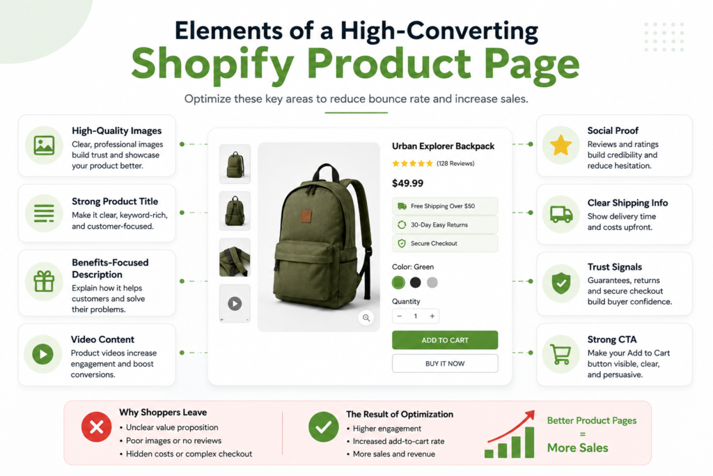
Your above-the-fold area should immediately communicate three things:
- What you’re selling
- Why the shopper should care
- What they should do next
For example, a product title such as “Premium Everyday Backpack” tells the shopper what the product is, but it does little to explain why it is different. A stronger presentation might highlight a specific benefit, such as durability, laptop protection, or lightweight travel design.
The same principle applies to your product images. A single attractive photo may not answer the questions a buyer has. They may want to see the product from different angles, understand its size, inspect important details, or see it being used in a realistic setting.
Think of your product page as a salesperson. Every important question left unanswered creates another reason for the customer to hesitate.
The Difference Between Traffic Problems and Product-Page Problems
One of the most important steps in diagnosing low sales is separating a traffic problem from a conversion problem.
Imagine two Shopify stores:
| Store | Monthly Visitors | Purchases | Conversion Rate |
| Store A | 5,000 | 25 | 0.5% |
| Store B | 2,000 | 40 | 2.0% |
Store A has more traffic, but Store B generates more orders. That tells you something important: traffic volume alone doesn’t determine revenue.
If visitors are coming from search terms, ads, or social posts that don’t match the product they’re seeing, improving the product page may not solve the underlying issue. You need to examine the entire path:
Traffic source → Landing page → Product page → Add to cart → Checkout → Purchase
Look for clues in your analytics. If visitors leave almost immediately, investigate whether the page matches the promise that brought them there. If they spend time on the page but rarely add the product to their cart, examine your offer, product information, pricing, trust signals, and calls to action.
This is also why technical SEO matters. A store can attract search traffic while still losing potential customers because of weak page structure, poor search intent alignment, or other SEO issues. If those problems sound familiar, review these Shopify SEO mistakes that can keep your products from reaching the right searchers: 13 Shopify SEO Mistakes That Keep Your Products Off Google’s First Page
The key is to diagnose the right bottleneck before changing everything at once.
The Hidden Friction That Makes Shoppers Leave
Sometimes nothing appears obviously “wrong” with a product page. The images look good. The description exists. The Add to Cart button works. Yet sales remain weak.
That’s where hidden friction becomes important.
Common examples include:
- Shipping costs that appear too late
- Unclear delivery estimates
- Complicated product variants
- Weak or missing customer reviews
- Generic product descriptions
- Unclear return policies
- Poor mobile layout
- Slow-loading product images
- Too many popups or distractions
- A call-to-action that blends into the page
- Product benefits buried beneath long blocks of text
- Missing answers to obvious customer questions
Consider a shopper who likes a $49 product but cannot find out when it will arrive. They may not complain or contact support. They simply leave and look for another store that provides the answer immediately.
That is why Shopify product page conversion optimization is not about adding more elements to the page. It is about removing uncertainty and making the buying decision easier.
A useful audit is to open your product page as if you’ve never seen your brand before and ask:
- Can I understand the product within five seconds?
- Do I immediately see its main benefit?
- Do the images answer my basic questions?
- Can I easily find the price, shipping, and return information?
- Do I have enough evidence to trust the seller?
- Is the next step obvious?
- Would this page still feel easy to use on my phone?
If several answers are “no,” you have clear opportunities to improve the page before spending more money on traffic.
AI Prompt: Diagnose Why Your Shopify Product Page Isn’t Converting
You can use an AI assistant to perform a structured first-pass audit instead of relying entirely on guesswork. Give it your product page copy, product details, customer reviews, pricing, shipping information, and—if available—conversion data.
Use this prompt:
Act as a Shopify conversion rate optimization expert and ecommerce UX auditor. Analyze the product page information I provide and identify the most likely reasons visitors may leave without buying. Evaluate the page across product positioning, headline clarity, benefits, images, pricing, trust signals, reviews, shipping, returns, objections, calls to action, mobile UX, and purchase friction. Separate high-impact problems from low-priority improvements. For every problem, explain why it may reduce conversions and give one specific change I should test. Do not make assumptions about my customers without evidence. End with a prioritized 10-point action plan ranked by potential impact and implementation difficulty.
The goal isn’t to let AI make random changes to your store. Use it to surface questions and potential friction points you may have overlooked, then validate those recommendations against your analytics, customer feedback, and actual buying behavior.
Once you understand why visitors hesitate, the next step is identifying the specific product-page mistakes that repeatedly push otherwise interested shoppers away.
13 Shopify Product Page Mistakes That Push Customers Away
A Shopify product page can look polished and still fail at its most important job: giving a shopper enough confidence to buy. In many cases, the problem isn’t a lack of traffic. It’s a collection of small details that create hesitation between “This looks interesting” and “I’m ready to purchase.”
The following three mistakes are especially damaging because they affect the shopper’s confidence, understanding, and willingness to take the next step.
Weak Product Images That Fail to Build Confidence
Your product images are often the first serious piece of evidence a shopper uses to decide whether your product is worth considering. If the images are blurry, poorly lit, inconsistent, too small, or fail to show the product from useful angles, visitors may leave before reading a single word.
Think about the experience from the shopper’s perspective. They can’t physically touch the product, inspect its materials, compare its size, or see how it works. Your images have to do much of that work.
A strong product image set should answer questions such as:
- What does the product actually look like?
- What are its important features?
- How large or small is it?
- What does it look like from different angles?
- How is it used?
- What does the product look like in a real environment?
- What exactly will arrive after purchase?
For example, a desk-accessory brand shouldn’t rely on one isolated product shot. It could show the product against a clean background, a close-up of its materials, a side or back view, dimensions, and a lifestyle image showing it being used on a real desk.
Don’t use images simply because they look attractive. Use them because they remove uncertainty.
A useful image audit is simple: open your product page as if you’ve never seen the product before. Scroll through every image and ask, “What question would a customer still have after seeing this?”
If several important questions remain unanswered, your photography is probably costing you conversions.
Unclear Product Benefits and Generic Descriptions
Another common reason why Shopify product pages don’t convert is that they describe the product without explaining why the customer should care.
Features tell shoppers what the product has. Benefits explain what the product does for them.
Consider this example:
“Made with 100% cotton and available in five colors.”
That’s useful information, but it doesn’t create much desire.
A benefit-focused version might explain how the fabric feels comfortable throughout the day, holds its shape, and works easily with everyday outfits. The shopper can now connect the feature to an outcome they actually value.
Before publishing a product description, identify:
- The customer’s biggest problem.
- The product feature that addresses it.
- The practical benefit that feature provides.
- The result the customer can expect.
- The objection that could prevent the purchase.
Then structure the copy around those answers.
Your product page should also communicate its primary value proposition quickly. A visitor shouldn’t have to read five paragraphs to understand what makes the product different.
This is particularly important when you’re competing against dozens of similar products. Generic copy makes your offer blend into the market.
If you’re looking at your entire Shopify store and wondering why some pages attract attention while others fail to generate meaningful action, it can help to compare the underlying characteristics of successful stores. Our analysis of 7 traits shared by top-traffic Shopify stores provides a useful broader framework for evaluating your own store.
Missing Trust Signals, Reviews, and Social Proof
Even when shoppers understand the product and like what they see, one question can stop the purchase:
“Can I trust this store?”
That question becomes more important when the customer has never purchased from you before.
A product page should reduce perceived risk wherever possible. Useful trust elements include:
- Genuine customer reviews
- Star ratings
- Customer photos or user-generated content
- Clear shipping information
- Transparent return and refund policies
- Secure payment options
- Accurate product specifications
- Easily accessible contact information
- Guarantees or warranties when applicable
- Clear information about delivery times
Social proof is particularly powerful because it shows shoppers that other people have already made the decision they’re considering.
But don’t treat reviews as decoration. The most useful reviews address the exact questions potential buyers are asking. A review saying “Great product!” provides limited decision-making value. A detailed review explaining how the product performed after several weeks, what the buyer liked, and who it was best suited for gives future customers much more confidence.
Also avoid manufacturing trust. Fake reviews, exaggerated claims, manipulated ratings, and misleading urgency can create short-term clicks but damage long-term credibility.
When evaluating your page, ask:
“What evidence would a skeptical first-time customer need before feeling comfortable buying this product?”
That question is at the heart of effective Shopify product page optimization. The goal isn’t simply to make a page look professional. It’s to systematically remove the doubts that stand between interest and purchase.
AI Prompt: Audit Your Shopify Product Page for Conversion-Killing Mistakes
You can use an AI assistant to perform a structured first-pass audit before making changes. Give it your product-page copy, product details, customer reviews, pricing, shipping information, and a description of your current images.
Use this prompt:
Act as a Shopify conversion rate optimization expert and ecommerce UX auditor. Analyze the product page information I provide and identify the reasons a qualified visitor might leave without buying. Evaluate the page across product images, value proposition, product benefits, descriptions, pricing, trust signals, reviews, social proof, shipping, returns, objections, calls to action, mobile usability, and purchase friction.
For every problem you identify, explain:
- What is wrong
- Why it could reduce conversions
- How a shopper might interpret it
- The specific change I should make
- How I could test whether the change improves performance
Prioritize the problems by potential conversion impact. Do not give generic Shopify advice. Base every recommendation on the information provided, and clearly identify anything you cannot evaluate without additional data.
Finish with a prioritized 10-point action plan for improving this product page.
The important part is the instruction to prioritize problems by potential impact. An audit that produces 30 random recommendations isn’t nearly as useful as one that tells you which three changes deserve attention first.
That approach also makes Shopify product page conversion optimization more systematic: identify the friction, form a hypothesis, make one meaningful improvement, and measure what happens.
How to Improve Shopify Product Page Conversion Rate With Better Buyer Psychology
A product page does not convert simply because it contains the right information. It converts when that information answers the questions running through a shopper’s mind at the right moment:
What is this?
Is it right for me?
Can I trust this store?
Is it worth the price?
What happens if I change my mind?
That is the foundation of effective Shopify product page optimization. Instead of trying to persuade every visitor with more text, focus on removing uncertainty and making the buying decision easier.
Make the Value Proposition Instantly Clear
Most shoppers do not carefully read a product page from top to bottom. They scan. Within seconds, they should understand what the product is, who it is for, and why it is worth considering.
A weak value proposition might say:
“Premium Stainless Steel Water Bottle — 32 oz”
That identifies the product, but it does little to communicate its value.
A stronger version could be:
32 oz Insulated Water Bottle That Keeps Drinks Cold for 24 Hours
Now the shopper immediately sees the product, its key benefit, and a meaningful reason to care.
When reviewing your product page, ask:
- Can someone understand the main benefit without scrolling?
- Does the headline focus on the customer rather than the company?
- Is the most important differentiator obvious?
- Does the product solve a specific problem?
- Does the first screen give shoppers a reason to keep exploring?
Your value proposition should not try to communicate everything. Choose the one or two benefits most likely to influence the purchase decision and make those impossible to miss.
Remove the Most Common Purchase Objections
A shopper can want your product and still decide not to buy it. Often, the problem is not lack of desire—it is an unanswered objection.
Consider someone buying a $79 skincare product. They may immediately wonder:
- Will this work for my skin type?
- How long will shipping take?
- Can I return it?
- Are the ingredients safe?
- Is this actually worth $79?
- What happens if I don’t like it?
If your product page does not answer those questions, the shopper has to make assumptions. Many will simply leave and continue comparing alternatives.
This is one of the most important principles behind why Shopify product pages don’t convert: uncertainty creates friction.
Build an objection checklist for each major product. Look at:
Price: Explain what makes the product worth the cost.
Shipping: Clearly state shipping costs, delivery estimates, and any free-shipping threshold.
Returns: Make the return or refund policy easy to find.
Quality: Use detailed product photography, specifications, materials, certifications, or demonstrations where relevant.
Fit: Provide sizing charts, dimensions, compatibility information, or use cases.
Results: Use credible customer reviews, testimonials, demonstrations, or user-generated content.
A useful rule is simple: If customers repeatedly ask the same question before buying, that question belongs on the product page.
Use Pricing, Offers, and Calls to Action More Persuasively
Price is rarely evaluated in isolation. Shoppers compare it with the perceived value, alternatives, benefits, and risk of making the wrong decision.
That means simply lowering your price is not always the best way to increase conversions.
Instead, make the value easier to understand. For example:
| Weak presentation | Stronger presentation |
| $89 | $89 — includes two replacement filters |
| Shipping calculated at checkout | Free shipping on orders over $50 |
| Buy Now | Add to Cart |
| Premium quality | Made with 100% stainless steel |
| Limited stock | Only 4 left in stock |
The stronger examples provide context, not empty persuasion.
Your call to action should also be visually obvious and describe a clear next step. Avoid surrounding the primary CTA with competing buttons, excessive popups, or distracting promotional messages.
For higher-priced products, consider placing reassurance close to the CTA:
Add to Cart
Free U.S. shipping • 30-day returns • Secure checkout
That combination reduces friction at the precise moment the shopper is deciding whether to proceed.
For practical Shopify product page conversion optimization, start with one product rather than redesigning your entire catalog. Review the page as if you were a first-time customer, identify the three biggest sources of hesitation, and address those first.
AI Prompt: Rewrite Your Product Page Around Customer Buying Psychology
AI can help identify gaps in your messaging, but the quality of the output depends heavily on the information you provide. Instead of asking an AI assistant to “make my product description better,” give it the product details, target customer, objections, competitors, price, benefits, reviews, and existing copy.
Ask it to analyze the page from the buyer’s perspective and identify:
- The strongest customer benefit.
- The biggest unanswered purchase objections.
- Claims that sound vague or unsupported.
- Missing trust information.
- Opportunities to improve the headline, benefits, product description, and CTA.
- Places where the copy creates unnecessary friction.
Then have it rewrite only the weak sections while preserving accurate product claims.
This approach makes AI a conversion-analysis assistant, rather than a tool for generating generic marketing language. More importantly, it gives you a repeatable process for improving product pages across your store—and can help you get more sales from Shopify product pages without relying on discounts alone.
Shopify Product Page Optimization: Build a Page That Moves Shoppers Toward Checkout
Getting a visitor to your product page is only half the job. The product page itself has to answer the shopper’s most important questions quickly enough to keep them moving toward a purchase: What is this? Why do I need it? Can I trust this store? What exactly will I get? How much will it cost me?
Strong Shopify product page optimization brings these answers together in the right order. Instead of treating the page as a collection of images, text, and buttons, think of it as a guided buying experience. Every element should reduce uncertainty and make the next decision easier.
Create a Strong Above-the-Fold Product Experience
The first screen matters because shoppers shouldn’t have to scroll to understand what you’re selling. Your above-the-fold area should immediately communicate the product, its primary benefit, price, visual quality, and the next action.
A strong structure typically includes:
- Clear, specific product title
- High-quality primary product image
- Price and relevant offer information
- Short benefit-focused value proposition
- Product variants, if applicable
- Visible Add to Cart or purchase button
- Key trust or fulfillment information
For example, compare these two approaches:
Weak:
“Premium Everyday Backpack”
Stronger:
“Water-Resistant Laptop Backpack With 15-Inch Padded Sleeve”
The second version gives the shopper useful information immediately. It tells them what the product is, who it serves, and what feature matters.
Your CTA should also match the shopper’s next logical step. Avoid burying “Add to Cart” beneath a huge block of copy. At the same time, don’t surround it with competing buttons, popups, discount wheels, and promotional banners.
A useful test is simple: If a first-time visitor saw only the top portion of the page, could they explain what you’re selling and why it might be worth buying?
If not, start there.
Optimize Product Images, Variants, Descriptions, and Benefits
Product information should eliminate questions rather than create new ones.
Images are particularly important because online shoppers cannot physically touch, examine, or try the product. Use multiple images to show the product from different angles and, when appropriate, demonstrate its size, scale, texture, use, packaging, or key features.
Your product description should follow the same principle. Don’t simply list specifications. Connect features to outcomes.
Instead of:
“Made with 100% stainless steel.”
Consider:
“Made with durable stainless steel that resists everyday wear and keeps its clean finish longer.”
The first statement provides a specification. The second explains why the specification matters.
For variants, make choices obvious. If customers need to select size, color, material, capacity, or another option, label each choice clearly and show relevant information before they commit to the purchase.
This is also where you should audit your page against your broader sales funnel. If your store receives plenty of Google traffic but very few purchases, the problem may not be traffic alone. Your product page may be failing to convert the intent that brought visitors there. For a deeper look at this distinction, see why your Shopify store gets Google traffic but almost no sales.
A practical product-information checklist:
- Does the first image show the product clearly?
- Do additional images answer common buyer questions?
- Does the description explain benefits, not just features?
- Are important specifications easy to scan?
- Are variants clearly labeled?
- Is the price immediately visible?
- Can shoppers understand the product without reading a huge wall of text?
Strengthen Shipping, Returns, Guarantees, and Other Trust Elements
A shopper can want your product and still refuse to buy it because of uncertainty.
“When will it arrive?”
“What if it doesn’t fit?”
“Can I return it?”
“Are there unexpected shipping charges?”
“Is this store legitimate?”
These questions often appear immediately before the purchase decision. If your product page doesn’t answer them, customers may leave to look for answers elsewhere—or abandon the purchase completely.
Make important policies easy to find near the buying area. Clearly communicate shipping costs, estimated delivery windows, return conditions, guarantees, and other information that could affect the decision.
Trust can also come from:
- Verified customer reviews
- Product ratings
- Customer photos or user-generated content
- Clear contact information
- Secure payment options
- Transparent pricing
- Accurate product claims
- Easy-to-find return information
Don’t hide important conditions behind vague language. Transparency is part of conversion optimization.
AI Prompt: Optimize Your Shopify Product Page for Higher Conversions
Once you’ve fixed the obvious problems, use an AI assistant to perform a structured page audit rather than simply asking it to “make my product page better.”
Paste your current product-page copy, product details, target customer, pricing, and any available conversion data into ChatGPT, Gemini, Claude, or another capable AI assistant. Then use a prompt like this:
Act as a Shopify conversion rate optimization specialist and ecommerce UX expert. Audit the following product page for factors that could prevent visitors from purchasing. Evaluate the product title, value proposition, images, benefits, description, pricing presentation, variants, calls to action, trust signals, shipping information, return policy, objections, and mobile shopping experience. Identify the five highest-impact conversion problems, explain why each could create buyer hesitation, and provide a specific recommended change for each. Then rewrite only the sections that need improvement while keeping the brand voice natural and trustworthy. Do not invent product features, guarantees, reviews, shipping times, or claims that I have not provided.
The important part is the diagnostic approach. AI should help you identify friction and test clearer messaging—not manufacture claims that make the product sound better than it really is.
That makes AI a useful implementation tool within your Shopify product page conversion optimization process, while the final decisions remain grounded in your actual customers, products, policies, and performance data.
Why Mobile Shoppers Leave Shopify Product Pages Without Buying
A product page can look excellent on a desktop screen and still create a frustrating buying experience on a phone. That matters because mobile shoppers often have less patience for slow loading, awkward navigation, tiny buttons, confusing product options, or content that forces them to hunt for basic information. Mobile Shopify product page optimization therefore requires more than simply making a desktop layout responsive. You need to make the entire buying journey easy to understand and easy to complete with a thumb.
Fix Slow-Loading Images and Performance Problems
Large product images are one of the most common performance problems on ecommerce pages. High-resolution photos are valuable for helping shoppers evaluate a product, but uploading unnecessarily large files can slow down the first meaningful view of the page.
The problem becomes especially noticeable when a shopper arrives from Google, Instagram, Facebook, or a paid ad and expects the product to appear immediately. If the screen remains blank, jumps around, or takes too long to become interactive, the shopper may leave before seeing your offer.
Google recommends measuring real-world page performance across mobile and desktop devices. Its Core Web Vitals include Largest Contentful Paint (LCP), Interaction to Next Paint (INP), and Cumulative Layout Shift (CLS), which help identify loading, responsiveness, and visual stability problems.
For Shopify product pages, start with these practical fixes:
- Compress product images without making them visibly blurry.
- Use appropriately sized images instead of uploading oversized originals.
- Remove unnecessary apps and scripts that slow down the page.
- Avoid autoplay video unless it provides genuine product value.
- Test the product page on an actual smartphone, not just your desktop browser.
- Check performance with Google PageSpeed Insights and compare mobile results with real user data when available.
Don’t obsess over achieving a perfect score just for the sake of a green dashboard. Your priority is a fast, stable page that lets shoppers see the product, understand the offer, and interact with the page without friction.
Make Product Information and Add-to-Cart Actions Easy to Use
Mobile shoppers shouldn’t have to scroll through half the page to answer basic buying questions.
Within the first few seconds, they should be able to identify:
- What the product is
- What it costs
- What problem it solves or benefit it provides
- Which options are available
- Whether it is currently in stock
- How to buy it
Your product title, primary image, price, key benefit, variant selector, and add-to-cart action should work together as one clear decision-making area.
Pay particular attention to tap targets. A button that looks perfectly usable with a mouse can be frustrating on a touchscreen. Variant selectors should be easy to select, quantity controls should not require precision tapping, and important links should have enough spacing to prevent accidental clicks.
The add-to-cart button also needs to remain visually obvious. If a shopper has to scroll repeatedly between product information and the purchase button, you’re adding unnecessary friction to an otherwise simple decision.
A useful test is to hand your phone to someone who has never seen your store and ask:
“Show me where you would buy this product.”
If they hesitate, zoom in, scroll around, or ask where the button is, your mobile product-page UX needs work.
This is particularly important if your store already receives search traffic but struggles to turn that traffic into purchases. If that’s your situation, compare the product-page experience with the broader issues discussed in Why Your Shopify Store Gets Google Traffic but Almost No Sales.
Reduce Popups, Distractions, and Mobile Checkout Friction
A mobile shopper may already be interested in your product when something interrupts the buying process: an email popup covers the product, a discount wheel appears immediately, a chat window blocks the screen, or multiple promotional banners compete for attention.
Each element may have a legitimate purpose. The problem is cumulative friction.
Before adding another popup or promotional widget, ask whether it helps the shopper make a decision or simply asks for attention.
A cleaner mobile experience usually means:
- Let shoppers see the product before displaying aggressive promotional overlays.
- Keep essential product information above unnecessary promotional content.
- Make popups easy to close with a clearly visible button.
- Avoid stacking multiple overlays on the same visit.
- Remove apps that provide little measurable value.
- Make the path from product discovery to checkout obvious.
Checkout friction matters too. Unexpected shipping costs, unclear delivery estimates, difficult discount-code fields, or uncertainty about returns can turn purchase intent into abandonment.
This is why Shopify product page conversion optimization should not stop at the product description or add-to-cart button. The page has one job: reduce uncertainty and make the next action obvious.
AI Prompt: Audit Your Shopify Product Page for Mobile Conversion Problems
You can use an AI assistant as a second set of eyes before making changes. Give it your product-page copy, mobile screenshot, product details, and current conversion data, then use a prompt like this:
Act as a Shopify CRO and mobile UX specialist. Audit this product page specifically for smartphone shoppers. Identify problems with loading performance, above-the-fold content, product images, product information, pricing, variants, trust signals, CTA visibility, popups, navigation, shipping information, and checkout friction. For every problem, explain why it could reduce conversions, rate its severity as High, Medium, or Low, and provide one specific fix. Then create a prioritized 10-point action plan based on the changes most likely to improve the mobile buying experience. Do not recommend changes without explaining the user problem they solve.
The goal isn’t to implement every AI recommendation. Use the audit to identify patterns, then verify important issues with your analytics, PageSpeed data, and real-device testing. That combination gives you a much more reliable path to improving mobile conversions than making random design changes.
Shopify Product Page Conversion Optimization: What to Measure and Test
A product page can look polished and still lose sales. The problem is that Shopify product page conversion optimization cannot be judged by appearance alone. You need to know what shoppers are doing after they land on the page.
Instead of asking, “Does this page look good?” ask better questions: Are visitors adding the product to their cart? Are they reaching checkout? Which devices convert best? Where do shoppers leave? These answers turn vague sales problems into measurable problems you can actually fix.
Track Product Views, Add-to-Cart Rate, and Purchase Conversion
Start by measuring the journey from product discovery to purchase. At minimum, monitor these three stages:
Product views → Add to cart → Purchase
Each stage tells you something different.
| Metric | What it tells you | Possible problem |
| Product views | How much traffic reaches the page | Weak traffic, SEO, or targeting |
| Add-to-cart rate | Whether the page creates enough interest and confidence | Product-page friction |
| Purchase conversion rate | Whether interested shoppers complete the purchase | Price, shipping, trust, or checkout issues |
For example, imagine a product receives 2,000 monthly views, but only 30 visitors add it to their carts. The page may have a problem with its offer, messaging, images, price presentation, or perceived value.
Now imagine 200 visitors add the product to their carts, but only 20 purchase. That’s a different problem. The product page may be doing its job, while shipping costs, unexpected fees, delivery times, payment options, or checkout friction are causing the losses.
This distinction matters because otherwise you can waste weeks changing your product description when the real problem happens later in the funnel.
For each important product, create a simple monthly scorecard:
- Product page views
- Add-to-cart rate
- Checkout initiation rate
- Purchase conversion rate
- Revenue per visitor
- Mobile vs. desktop conversion
- Conversion by traffic source
Don’t obsess over one “perfect” conversion benchmark. Your own historical performance is often more useful because conversion rates vary significantly by product category, price, audience, traffic source, and purchase intent.
Find Where Shoppers Drop Out of the Buying Funnel
Your analytics should help you answer one critical question:
At which step does shopper intent disappear?
Consider this example:
10,000 visitors → 1,000 product views → 120 add to cart → 45 reach checkout → 20 purchases
The numbers don’t tell you exactly why shoppers leave, but they show you where to investigate.
A weak product-view-to-cart rate points toward the product page itself. Look closely at:
- Product images and video
- Product title and value proposition
- Product description
- Price and perceived value
- Reviews and ratings
- Product variants
- Shipping information
- Return policy
- Calls to action
- Trust signals
A strong add-to-cart rate combined with weak purchases points you further down the funnel. Investigate checkout friction, shipping costs, delivery expectations, payment methods, and unexpected charges.
You should also segment your data instead of looking only at overall averages. A product might convert well on desktop but poorly on mobile. Organic search traffic might convert at twice the rate of social traffic. Returning customers might purchase frequently while first-time visitors hesitate.
Those differences can reveal problems that an overall conversion rate hides.
A useful diagnostic rule is:
Don’t optimize the entire store based on one number. Find the biggest drop-off, identify the likely cause, then test one meaningful improvement.
Run A/B Tests Without Changing Too Many Variables at Once
Once you’ve identified a potential problem, resist the temptation to redesign the entire product page.
Changing the headline, images, price, description, reviews, CTA, and layout simultaneously may produce a different conversion rate—but you won’t know what caused the change.
Instead, test one major variable at a time whenever practical.
For example:
Test 1: Benefit-focused product headline vs. generic headline
Test 2: Lifestyle images vs. standard product images
Test 3: Shorter product description vs. detailed benefit-focused description
Test 4: Standard CTA vs. more specific CTA
Test 5: Existing shipping presentation vs. clearly displayed delivery information
Before running a test, define three things:
- Hypothesis: What do you believe is preventing conversions?
- Change: What specific element will you modify?
- Success metric: What behavior should improve?
For example:
Hypothesis: Shoppers hesitate because they cannot understand the product’s main benefit quickly.
Change: Rewrite the headline and first product-description section around the primary customer outcome.
Success metric: Increase add-to-cart rate.
Don’t declare a winner because of a handful of sales. Give the test enough traffic and time to produce meaningful evidence, and avoid changing the page repeatedly while the test is running.
This approach also prevents a common Shopify product page mistake: making decisions based on personal preference instead of customer behavior.
AI Prompt: Create a Shopify Product Page CRO Testing Plan
You can use an AI assistant to turn your analytics and observations into a structured testing roadmap. Give it actual numbers rather than asking it to make generic recommendations.
Prompt:
Act as an experienced ecommerce conversion rate optimization specialist. Analyze my Shopify product page performance and create a prioritized CRO testing plan.
Product page views: [insert number]
Add-to-cart rate: [insert percentage]
Checkout initiation rate: [insert percentage]
Purchase conversion rate: [insert percentage]
Mobile conversion rate: [insert percentage]
Desktop conversion rate: [insert percentage]
Average order value: [insert amount]
Product price: [insert amount]
Main traffic sources: [insert sources]
Product type: [describe product]
Target customer: [describe customer]
Identify the three most likely conversion bottlenecks. For each one, provide:
- The evidence supporting the hypothesis
- The specific page element to test
- The control version
- The proposed variation
- The primary KPI
- Secondary metrics to monitor
- Potential risks or confounding factors
- How I should prioritize the test based on likely impact and implementation effort
Do not recommend changing multiple major variables in one test. Focus on practical tests that can be implemented on a Shopify product page without a complete redesign.
The goal isn’t to test everything. It’s to find the highest-impact obstacle, make one informed change, measure the result, and repeat. That’s how product-page optimization becomes a systematic growth process instead of a cycle of guessing and redesigning.
How to Get More Sales From Shopify Product Pages With a Simple Optimization Plan
Getting more sales from your Shopify product pages does not always mean getting more traffic. In many cases, the faster opportunity is to get more value from the visitors you already have. If 1,000 people visit a product page but only a small percentage take the next step, improving that page can be more efficient than spending more money on ads.
The key is to stop treating every product page as equally important. A better approach to Shopify product page optimization is to identify where the greatest revenue opportunity exists, fix the highest-impact problems first, and then use real customer behavior to guide the next round of improvements.
Prioritize the Product Pages With the Biggest Revenue Opportunity
Don’t begin by redesigning your entire Shopify store. Start with the product pages that already have enough traffic to provide useful data but are producing fewer sales than they should.
Look for products with:
- High page views but low purchase rates
- Strong traffic but weak add-to-cart activity
- High add-to-cart rates but poor checkout completion
- Products receiving traffic from Google, social media, or paid ads
- High-margin products that could generate meaningful additional revenue
- Popular products with strong customer interest but weak conversion
For example, imagine two products:
| Product | Monthly Views | Add to Cart | Purchases | Priority |
| Product A | 2,500 | 7% | 1.1% | High |
| Product B | 180 | 8% | 2.4% | Low |
Product B has the better conversion rate, but Product A deserves attention first because it has substantially more traffic. A relatively small improvement to Product A could produce more additional orders.
This is an important distinction when diagnosing why Shopify product pages don’t convert. A low-performing page with almost no traffic may simply lack enough data. A high-traffic page with strong shopper interest but weak sales represents a much clearer optimization opportunity.
Start with your top 5–10 product pages rather than attempting to optimize your entire catalog at once.
Use a Product Page Conversion Audit Checklist
Once you’ve identified your priority pages, audit them systematically. Don’t rely on whether the page “looks good.” A product page can look polished while still leaving important buying questions unanswered.
Check each page against these areas:
1. Product clarity
- Is it immediately obvious what the product is?
- Does the title explain what matters to the buyer?
- Can shoppers understand the main benefit within seconds?
2. Product presentation
- Are the images sharp, consistent, and useful?
- Do they show different angles, details, scale, or real-world use?
- Does the first image communicate the product clearly?
3. Persuasive information
- Does the description explain benefits instead of simply listing features?
- Does it answer common pre-purchase questions?
- Is important information easy to scan?
4. Trust
- Are reviews visible?
- Is social proof credible and specific?
- Are shipping times, return policies, and guarantees easy to find?
- Does the store provide enough information for a first-time buyer to feel comfortable?
5. Conversion path
- Is the add-to-cart button obvious?
- Are variants easy to select?
- Are pricing and discounts understandable?
- Are unnecessary distractions removed?
6. Mobile experience
- Does the page load quickly?
- Are images and text easy to view?
- Can shoppers select variants and add the product to their cart without struggling?
You can turn this into a simple scoring system: give each category a score from 0 to 2, where 0 means missing, 1 means needs improvement, and 2 means strong. Pages with the lowest scores become your first optimization targets.
Turn Customer Questions and Analytics Into Ongoing Improvements
Your product page should evolve as you learn more about your customers. Instead of guessing what shoppers want to know, pay attention to the questions they repeatedly ask.
Customer emails, live chat conversations, product reviews, support tickets, search queries, and comments can reveal objections that your current product page isn’t addressing.
Suppose customers repeatedly ask:
“Does this fit a 15-inch laptop?”
That question shouldn’t remain buried in customer support. If it matters to multiple buyers, add the answer directly to the product page.
The same principle applies to questions about sizing, materials, compatibility, shipping time, durability, installation, returns, or what is included with the purchase.
Your analytics can reveal the other half of the problem. Watch how visitors move through the funnel:
Product view → Add to cart → Checkout → Purchase
If product views are high but add-to-cart activity is weak, investigate the product page itself. If add-to-cart activity is healthy but purchases are low, examine shipping costs, checkout friction, payment options, or unexpected charges.
Shopify’s own analytics and reporting tools can help merchants evaluate store performance and customer activity, making them useful starting points for this type of ongoing analysis.
The goal isn’t to make dozens of changes at once. Make one meaningful improvement, monitor the relevant metric, and then decide what to test next. That creates a repeatable Shopify product page conversion optimization process instead of a one-time redesign.
AI Prompt: Create a 30-Day Shopify Product Page Optimization Action Plan
Once you’ve completed the audit, an AI assistant can help turn your findings into a prioritized implementation plan.
Copy and customize this prompt:
Act as a Shopify conversion rate optimization specialist. Analyze the following product-page audit and create a 30-day optimization plan. Prioritize changes based on likely impact, implementation difficulty, traffic volume, and potential revenue opportunity. Separate the plan into Week 1, Week 2, Week 3, and Week 4. For every recommendation, explain the problem, the specific change to make, the metric to monitor, and how to determine whether the change worked. Do not recommend changes without explaining the reasoning.
Product/page data:
Product: [product name]
Monthly product-page views: [number]
Add-to-cart rate: [percentage]
Checkout rate: [percentage]
Purchase conversion rate: [percentage]
Average order value: [amount]
Main traffic sources: [Google/social/ads/email/etc.]
Common customer questions: [questions]
Current weaknesses: [list]
Mobile issues: [list]
Reviews/social proof: [details]
The important part is to give the AI real store data rather than asking for generic advice. The more specific your inputs are, the more useful the resulting action plan becomes.
That same discipline should guide your overall approach: identify the pages with the greatest opportunity, diagnose the actual friction, make focused improvements, and measure what changes. That’s how Shopify product page optimization becomes an ongoing revenue strategy rather than another checklist you complete once and forget.