
A great handmade product can take hours to create and still look strangely inexpensive online. The frustrating part is that the problem may have nothing to do with the quality of your work. A buyer sees the photo, cover, thumbnail, packaging, or product page first—and those visual signals can shape their opinion before they ever understand how much effort went into the product.
That is where handmade product presentation becomes critical. You may have carefully chosen materials, refined every detail, and created something genuinely valuable, yet inconsistent branding, weak photography, cluttered backgrounds, poor mockups, or amateur-looking visuals can make the finished product feel less polished than it really is.
And that perception matters. When your handmade product looks basic, buyers may hesitate to pay your price, scroll past your listing, or compare you with cheaper alternatives. For digital creators selling ebooks, templates, courses, or AI prompts through Gumroad, the same problem appears in a different form: your cover, thumbnail, preview, and product page become the packaging customers judge.
The good news is that making a handmade product look more premium does not necessarily mean spending more money. Small changes in photography, styling, branding, presentation, and perceived value can dramatically change how your work is understood.
The key is knowing which visual details are quietly working against you—and which ones make buyers think, “This looks worth paying for.”
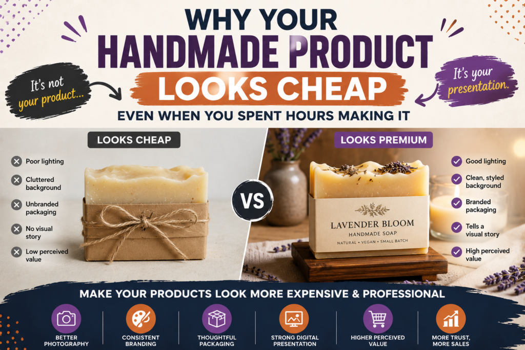
Why Your Handmade Product Looks Cheap Even When the Quality Is High
You can make something carefully, spend hours refining the details, and still have a buyer think, “It looks nice, but I’m not sure it’s worth that price.” That disconnect is usually not a craftsmanship problem. It is a perception problem.
A handmade product has two different kinds of value: the value you put into making it and the value a buyer can recognize from what they see. Those two numbers are not automatically the same. Research on product evaluation has found that product presentation can influence how consumers assess perceived product quality, particularly when they are evaluating a product online or with limited direct interaction.
That is why perceived product value deserves as much attention as the product itself. A beautifully crafted item photographed under harsh lighting, placed against a distracting background, or shown with inconsistent branding can communicate less quality than it actually has. The reverse is also true: thoughtful presentation can make the craftsmanship easier to recognize.
For a digital creator, the same principle applies. An ebook, template, course, or AI prompt pack does not have physical craftsmanship for a buyer to examine. Its cover, mockup, screenshots, typography, product description, and overall digital product presentation become important quality cues. On Gumroad, creators can add product descriptions, images, videos, content, covers, and thumbnails to shape that presentation.
The Difference Between Product Quality and Perceived Product Value
Product quality is what actually exists in the product. Perceived value is what the buyer believes that quality is worth based on the information available to them.
That distinction is crucial.
Imagine two creators sell nearly identical handmade journals. Both use high-quality paper, durable binding, and carefully finished covers.
Creator A photographs the journal on a cluttered desk using dim overhead lighting. The cover is slightly crooked, the image is low-resolution, and the product description barely explains what makes the journal different.
Creator B uses clean lighting, a simple background, consistent colors, several useful angles, and a clear description showing the journal’s materials and details.
The physical products may be equally good. Yet the second handmade product is easier for a buyer to interpret as high quality.
This is not necessarily because buyers are superficial. Online shoppers have limited information. They cannot pick up the product, inspect the stitching, feel the paper, examine the finish, or ask you to demonstrate every detail before deciding whether to buy.
So they rely on available cues.
Those cues can include:
- Product photography
- Visual consistency
- Packaging
- Typography
- Color choices
- Image quality
- Product descriptions
- Reviews and reputation
- Pricing
- Demonstrations and previews
- Overall professionalism
Research on online product evaluation supports this broader idea: consumers use multiple product cues when forming quality perceptions, and product presentation can contribute to those judgments.
For handmade sellers, there is an important opportunity here. Your craftsmanship is already an asset. The goal is not to make your product look artificially luxurious. It is to make the visible presentation accurately communicate the quality that is already there.
The same principle applies to a Gumroad creator selling a $19 ebook or a $49 template bundle. The buyer cannot see the hours of research, editing, organization, testing, and refinement behind the file. They see the presentation first.
If the presentation makes the product appear rushed, generic, or unfinished, the buyer may never discover how much work is actually inside it.
Visual Signals That Make a Handmade Product Feel Less Premium
A product does not need to be poorly made to look inexpensive. Sometimes a handful of small visual inconsistencies create that impression.
Here are some of the most common signals to examine.
1. Weak or inconsistent images
If one image is bright and another is dark, one uses a clean background while another shows household clutter, or the product appears at a different scale in every image, the overall presentation can feel less controlled.
2. Distracting backgrounds
The buyer should understand what they are supposed to look at immediately. A complicated background can compete with the product instead of supporting it.
3. Poor visual hierarchy
When everything is emphasized, nothing stands out. This applies to physical-product photos as well as digital products. If a product cover contains several competing headlines, multiple fonts, decorative graphics, and too many colors, the buyer may struggle to identify the main value proposition.
4. Inconsistent branding
Random fonts, colors, image styles, labels, or graphics can make an otherwise excellent product appear disconnected from the rest of your business.
5. Low-quality mockups
For digital products, an unrealistic or poorly aligned mockup can reduce confidence rather than increase it. A mockup should help the buyer understand the product—not distract them from it.
6. Hiding the details that prove quality
Sometimes creators spend so much time trying to make a product look beautiful that they fail to show the details that justify its value.
A handmade leather wallet, for example, may need close-up images showing the stitching, texture, edges, hardware, and interior. A template bundle may need screenshots showing the actual pages and features. An ebook may benefit from previews that demonstrate its organization and depth.
The presentation should make quality visible.
This matters because visual appearance can influence product judgments, but the appropriate visual signal depends on what the buyer actually values. Recent research on product appearance, for example, shows that surface characteristics can shape perceptions such as durability and user-friendliness.
So “make it look expensive” should not mean blindly adding luxury cues.
A rustic handmade product may need warmth and authenticity. A minimalist digital template may need clean spacing and restrained typography. A professional business ebook may need structure and clarity rather than decorative effects.
The goal is appropriate perceived value, not maximum decoration.
Why Buyers Judge Presentation Before They Understand Your Craftsmanship
This is where creator effort and buyer perception often collide.
You know the story behind the product.
You know that the materials took time to source. You know that you redesigned the template six times. You know that you spent an entire weekend editing the ebook. You know that the stitching is stronger, the files are better organized, or the prompt library has been carefully tested.
The buyer does not know any of that yet.
They encounter the product through a limited set of signals.
That is particularly important online, where physical inspection is unavailable. Research into online product presentation has found that presentation quality can influence attitudes toward products and websites, reinforcing the importance of how products are visually communicated in digital environments.
Think of presentation as the translator between your work and the buyer’s perception.
If the translator is unclear, your actual quality can get lost.
For example, suppose you create a comprehensive AI prompt bundle and sell it through Gumroad. You may have spent weeks organizing prompts, testing outputs, removing duplicates, and improving instructions.
But imagine the product page shows:
- A generic cover
- A tiny thumbnail
- No meaningful preview
- A vague product description
- No screenshots
- No clear explanation of who the product is for
The buyer cannot easily see the work you invested.
Gumroad allows creators to provide product descriptions, additional information, content, images, and other presentation elements. It also supports distinct product thumbnails, which Gumroad describes as serving browsing contexts such as profiles, customer libraries, and Discover.
That means your digital product presentation should answer a simple question:
“Can a stranger understand the quality and usefulness of this product without knowing how much work I put into it?”
If the answer is no, improving the presentation may be more valuable than simply creating more features.
This is also why creators should separate effort-based thinking from buyer-based thinking.
You might think:
“I spent 30 hours making this.”
The buyer thinks:
“What am I getting, and does it look useful enough to justify the price?”
Both perspectives are valid, but only the second one determines what the buyer can evaluate before purchasing.
A useful way to audit your own product is to temporarily forget everything you know about how it was created. Open the listing, product page, or sales page as if you were seeing it for the first time.
Then ask:
- What do I think this product is within five seconds?
- Who does it appear to be for?
- What quality level does the presentation communicate?
- What details make it feel trustworthy?
- What details make it feel generic or unfinished?
- Can I understand what I am actually buying?
- Can I see evidence that supports the product’s claims?
- Does the presentation match the price?
That last question is especially important.
A premium price does not automatically create premium perception. But a well-aligned product, presentation, positioning, and buyer expectation can make the price easier to understand.
Your goal, then, is not to make every handmade product look luxurious.
It is to eliminate the visual and informational friction that prevents buyers from recognizing the quality that is already there.
AI Prompt: Diagnose Why a Handmade Product Looks Cheap
Purpose
Use AI as a second set of eyes to identify presentation problems you may no longer notice because you are too familiar with your own product.
Prompt:
Act as a professional product presentation strategist, consumer psychology specialist, and conversion-focused visual auditor.
I sell the following product:
Product: [Describe your handmade or digital product]
Target buyer: [Describe your ideal customer]
Price: [$X]
Sales platform: [Gumroad / Etsy / Shopify / Website / Other]
Product presentation: [Paste your product description and/or describe your photos, cover, thumbnail, mockups, packaging, colors, typography, and layout]
Analyze the presentation from the perspective of a first-time U.S. buyer who knows nothing about my product or the amount of work behind it.
Identify:
- The first impression the presentation is likely to create.
- Which elements communicate quality and professionalism.
- Which elements could make the product appear cheap, generic, rushed, or confusing.
- Whether the visual presentation matches the product’s price.
- Whether the product’s main benefit is immediately understandable.
- Any problems with visual hierarchy, typography, color, composition, image quality, mockups, or consistency.
- Which three changes would have the greatest potential to improve perceived value.
- What should NOT be changed because it supports the product’s authentic identity.
Separate your recommendations into High Impact, Medium Impact, and Low Impact.
Do not recommend expensive redesigns unless they are genuinely necessary. Prioritize practical improvements that a small creator can implement with existing tools.
Finish with a concise Before → After presentation plan containing the five most important changes.
How to use it:
Give the AI as much real information as possible. For a visual audit, include the actual product images, cover, thumbnail, mockup, or screenshots when your AI tool supports image input. If you are selling through Gumroad, include the current product description and explain how the product appears on the page.
Customize:
- Product type
- Target buyer
- Price
- Sales platform
- Current product description
- Brand style
- Existing colors and fonts
- Product images or screenshots
- Main buyer promise
- Biggest presentation concern
How Handmade Product Presentation Shapes Buyer Perception
A strong handmade product presentation does more than make your listing look attractive. It helps buyers quickly understand what matters, where to look, and why the product deserves their attention. When the presentation feels organized and intentional, the craftsmanship has a better chance of being noticed.
This matters even more online because buyers cannot physically hold your product, examine its materials, or see the hours you spent making it. They experience your product through the visual information you provide. For a digital product, the same principle applies to the cover, mockups, screenshots, typography, and overall product page.
Create a Clear Visual Focal Point
Every product image, listing graphic, or digital product cover needs a clear visual focal point—the element you want the buyer to notice first.
If everything competes for attention, nothing gets it.
For example, imagine an ebook cover with the title, subtitle, author name, five badges, three illustrations, a discount message, and several different fonts. Even if the ebook itself is excellent, the cover can feel crowded and inexpensive because the viewer has to work to determine what matters.
A stronger composition gives the viewer an obvious starting point:
- Primary element: What is the product?
- Supporting element: What benefit or outcome does it offer?
- Secondary details: What additional information helps the buyer decide?
For a handmade physical product, the focal point might be the actual item, its most distinctive detail, or the craftsmanship you want buyers to notice.
For a Gumroad product, it might be the product name and its primary benefit on the cover or thumbnail.
This is closely related to visual hierarchy. Nielsen Norman Group describes visual hierarchy as guiding the eye through design elements according to their importance, with scale, contrast, and typography helping establish that order.
A simple test is to shrink your product image until it is roughly the size a buyer might see while browsing on a phone. Ask yourself:
Can I immediately tell what this product is and what makes it valuable?
If the answer is no, the design probably needs less information—not more.
The goal is not to make your product look elaborate. It is to make the important parts impossible to miss.
Use Color, Typography, and Composition Consistently
Professional presentation usually feels intentional because the individual design decisions appear to belong together.
That does not mean every element needs to look identical. It means your choices should feel connected.
For a handmade brand, consistency might mean using:
- The same two or three brand colors
- A consistent font pairing
- Similar photo backgrounds
- Repeatable label or packaging styles
- Consistent spacing and margins
- Similar image composition across listings
For digital products, the same principle applies to your covers, mockups, thumbnails, sales graphics, and product pages.
Suppose you sell a collection of productivity templates on Gumroad. One product uses a minimalist black-and-white cover, another uses bright neon colors, and a third uses a decorative script font. Each product might be individually attractive, but together they can make your storefront feel less established.
A consistent visual system can make the collection feel like it comes from one creator with a deliberate brand.
Gumroad allows creators to customize fonts, accents, and background colors across their profile, products, posts, and emails, which gives creators an opportunity to maintain a more cohesive visual identity.
The same principle applies to typography.
You do not need five impressive fonts to make a design look professional. In many cases, fewer typefaces and clearer size differences create stronger hierarchies. Nielsen Norman Group’s visual-design guidance similarly recommends using relative size and a limited number of type sizes to communicate importance.
A practical starting system is:
- One primary font for most text
- One complementary font when needed
- One dominant brand color
- One accent color
- One neutral background
- A consistent spacing system
Think of these decisions as your product’s visual vocabulary. Once established, reuse them rather than reinventing the design for every listing.
Remove the Small Details That Make Your Product Look Amateurish
Sometimes a product does not look cheap because of one major mistake. It looks cheap because several small details are slightly wrong at the same time.
A crooked label.
A distracting background.
A low-resolution image.
Too much text on a thumbnail.
Uneven spacing.
A random font.
Poor cropping.
Inconsistent colors.
None of these problems necessarily destroys a product presentation by itself. Together, however, they can change the overall impression.
This is why a useful presentation audit should focus on friction rather than simply asking whether the design is attractive.
Look for anything that makes the buyer pause and think:
- “What am I looking at?”
- “Which part is important?”
- “Is this professionally made?”
- “What exactly am I getting?”
- “Why does this look different from the creator’s other products?”
For physical handmade products, check the photo environment. Remove distracting objects that compete with the product. Make sure the item is clean and properly positioned. Avoid props that look unrelated or lower the perceived quality of the scene.
For digital products, inspect the equivalent visual details. A stretched mockup, tiny text, inconsistent screenshots, excessive badges, or generic-looking graphics can make a carefully created ebook, template, course, or AI prompt pack feel less valuable than it actually is.
The important distinction is this:
Your buyer evaluates the presentation they can see—not the effort they cannot see.
You may have spent 20 hours creating a template or several days developing an ebook. That effort matters to you as the creator, but the buyer needs visible evidence of quality before they can appreciate the work behind it.
That is why the presentation should communicate value rather than simply announce effort.
AI Prompt: Audit Your Handmade Product Presentation
Purpose: Use AI as a second set of eyes to identify visual inconsistencies, weak hierarchy, unclear positioning, and other details that could reduce perceived value.
Prompt:
Act as a senior product-branding and visual-presentation consultant for a small creative business.
I want you to audit the presentation of my product from a buyer’s perspective. Do not assume the product itself is low quality. Your job is to identify whether the way it is presented could make a high-quality product appear basic, confusing, inexpensive, or less valuable than it really is.
Product type: [handmade physical product / ebook / template / course / AI prompt pack / other]
Product name: [product name]
Target buyer: [describe ideal customer]
Price: [$X]
Where it is sold: [Gumroad / Etsy / website / other]
Product description: [paste description]
Main product image or cover: [attach image if available]
Additional images/mockups: [attach or describe them]
Brand colors: [colors]
Fonts: [fonts]
Main product benefit: [benefit]
Evaluate the presentation using these criteria:
- Visual hierarchy
- Focal point
- Color consistency
- Typography
- Composition and spacing
- Image or mockup quality
- Brand consistency
- Perceived product value
- Clarity of the product’s main benefit
- Trust and professionalism
Identify the five most important presentation problems, ranked by priority.
For each problem, explain:
- What the buyer is likely to notice
- Why it may reduce perceived value
- What I should change
- What I should avoid doing
Then give me a practical before-and-after improvement plan that I can implement without hiring an expensive designer.
If the presentation is already strong in an area, say so instead of inventing a problem.
Keep your recommendations specific to my product and target buyer.
How to use it:
Upload the actual product image, cover, thumbnail, or mockup whenever your AI tool supports image analysis. The visual input will make the audit substantially more useful than a text-only description.
Customize:
- Product type
- Target buyer
- Price
- Sales platform
- Product benefit
- Brand colors
- Fonts
- Product images
- Current product description
The goal of this audit is not to make your handmade product presentation more complicated. It is to remove anything that competes with the value you are already trying to communicate. Once the visual foundation is clear, the next challenge is making the actual photography look as polished as the product deserves.
Improve Handmade Product Photography Without Expensive Equipment
You do not need a professional camera, studio, or expensive lighting setup to make your product photos look polished. What matters most is control: control over light, background, framing, focus, and the visual elements surrounding the product.
For a handmade product, photography is more than documentation. Your photos communicate craftsmanship before a buyer has any opportunity to touch the item or examine it closely. The same principle applies to digital products: an ebook, template, course, or prompt pack needs clean visual presentation to communicate value before the buyer reads every detail.
Choose Better Lighting and Backgrounds
Lighting is one of the fastest ways to improve product photography. A technically expensive camera cannot rescue a poorly lit product, while a smartphone can produce strong results when the lighting and setup are controlled.
For most handmade sellers, soft, indirect natural light is a practical starting point. Try photographing near a large window rather than placing the product in direct sunlight. Direct sunlight can create harsh shadows and strong highlights that distract from textures and details.
A simple setup can be enough:
- Place the product near a bright window.
- Turn the product slightly toward the light rather than facing the window completely.
- Use a white poster board or foam board opposite the window to bounce some light back toward the darker side.
- Turn off mixed indoor lighting if it creates a different color temperature.
- Take several test photos from slightly different positions.
Your background matters just as much. A clean background helps the buyer focus on the product instead of competing objects.
For most products, start with a neutral surface or background. White, cream, soft gray, natural wood, or another restrained color can work well depending on the product’s materials and brand identity.
Avoid automatically choosing a pure white background for everything, though. A handmade candle, ceramic mug, leather accessory, or knitted item may look more compelling in a simple lifestyle setting that reinforces how the product is used.
The goal is not to make every image look identical. It is to make every visual decision feel intentional.
AI Can Make Your Creative Workflow More Efficient
You don’t need AI to replace your creativity. You can use it to make the creative process faster and more organized.
For example, AI can help you brainstorm product-photo concepts, develop visual directions, improve product descriptions, create marketing ideas, and turn one product into multiple pieces of content. The goal isn’t to let AI create everything for you—it is to remove some of the repetitive work so you can spend more time improving the product itself.
If you’re interested in seeing how ChatGPT and AI tools can be used beyond individual tasks and become part of a broader online-business workflow, I put together a practical guide that covers AI-powered content creation, digital products, freelancing, social media, marketing, and other creator workflows.
→ Explore the complete AI guide: The ChatGPT Millionaire: Your Guide to Earning Online with AI
Make Product Photos Look Clean, Sharp, and Professional
A professional-looking image usually starts with eliminating distractions rather than adding more effects.
Before photographing, clean the product carefully. Remove dust, fingerprints, loose threads, packaging scraps, and anything else that could make the item appear unfinished.
Then check the camera itself. Wipe your phone’s lens, tap the screen to focus on the product, and avoid excessive digital zoom. If the image looks soft, move the phone physically closer instead of relying heavily on zoom.
Your primary product image should make the item immediately understandable. A useful sequence is:
- Hero image: Shows the complete product clearly.
- Detail image: Highlights craftsmanship, texture, materials, or important features.
- Scale image: Shows the product in a realistic context or beside a familiar object.
- Lifestyle image: Demonstrates how the buyer might use or display it.
- Process or detail image: Reinforces authenticity when the handmade process itself adds value.
Consistency is especially important if you sell several products. Similar framing, lighting, backgrounds, and image proportions can make your storefront feel more established.
For digital creators, the equivalent is a consistent visual system across ebook covers, template previews, course graphics, and product mockups. If every product looks as though it came from a different brand, the collection can feel less cohesive even when each individual product is well made.
And remember that image quality should serve comprehension, not decoration. A buyer should be able to understand what they are purchasing within seconds.
Use Product Styling to Show Quality and Detail
Good product styling does not mean filling the frame with attractive props. It means creating context without allowing the props to compete with the product.
Suppose you sell handmade candles. A clean photo might include the candle, a subtle surface, and one or two carefully chosen elements that reinforce the mood. Adding ten decorative objects may make the image busier while making the actual product harder to evaluate.
Ask three questions before adding anything to a shot:
- Does this object help explain how the product is used?
- Does it reinforce the brand or mood?
- Does it make the product easier or harder to see?
If the answer to the third question is “harder,” remove it.
This is particularly important when you’re trying to make handmade products look more expensive. Premium presentation is often about restraint. Consistent colors, deliberate spacing, clean surfaces, and visible craftsmanship can communicate more value than elaborate decoration.
The same principle applies to a Gumroad creator selling a digital product. If you’re presenting an ebook, template, or AI prompt bundle, a mockup should make the product easier to understand—not bury it beneath gradients, badges, icons, and decorative elements.
If your digital products are getting attention but not converting, visual presentation is only one possible factor; the broader issue may involve positioning, offer clarity, or buyer objections as well. Those problems are worth diagnosing separately rather than assuming better images alone will solve them.
AI Prompt: Improve Your Handmade Product Photography
Purpose
Use AI as a visual-planning assistant before you take or redesign your product photos. It can help identify weaknesses in your current setup and create a practical shot list based on your product, available equipment, and target customer.
Prompt:
Act as a professional product photography director specializing in handmade and small-business products.
I sell [PRODUCT] to [TARGET CUSTOMER] at approximately [$ PRICE].
My available equipment is [SMARTPHONE/CAMERA], and I have access to [WINDOW LIGHT/LED LIGHT/OTHER EQUIPMENT].
My current photography setup is: [DESCRIBE BACKGROUND, LIGHTING, LOCATION, AND PROPS].
The product currently looks [TOO CHEAP/TOO DARK/FLAT/CLUTTERED/AMATEURISH/OTHER] in photos.
Analyze the setup from a buyer-perception perspective. Then provide:
- The five biggest visual problems to fix first.
- A low-cost lighting setup using only the equipment I already have.
- Three background options appropriate for this product and target customer.
- A recommended camera angle and framing approach.
- A five-photo shot list covering the hero image, details, scale, lifestyle, and craftsmanship.
- Props I should use, avoid, or remove.
- Specific changes that could make the product appear more polished and premium without misleading the buyer.
- A final pre-publishing checklist for reviewing each product photo.
Prioritize clarity, authenticity, craftsmanship, and perceived value. Do not recommend expensive equipment unless it would solve a specific limitation in my current setup.
How to use it: Replace the bracketed information with your actual product and setup. If you already have product photos, describe what looks wrong about them—or provide them to an AI tool that supports image analysis—and ask it to evaluate the visual issues against the same criteria.
Customize:
- Product type
- Target customer
- Price range
- Available camera or smartphone
- Lighting available
- Brand colors
- Desired visual style
- Main photography problem
- Selling platform
A stronger handmade product photography workflow does not begin with buying better equipment. It begins by deciding what the buyer needs to see, then building a simple visual setup that makes those qualities obvious.
How Branding and Packaging Can Make Handmade Products Look More Expensive
Build a Consistent Handmade Product Brand
A handmade product can be beautifully made and still feel inexpensive if the branding looks disconnected from the quality of the product. Buyers do not see the hours you spent selecting materials, refining details, or fixing small imperfections. They see the signals you give them: your logo, colors, typography, labels, photography, packaging, and overall presentation.
That is why handmade product branding should not be treated as decoration. It is part of how you communicate what kind of product the buyer should expect.
A strong brand does not have to mean an expensive logo or elaborate visual identity. For a small handmade business, consistency is usually more important than complexity.
Start by defining a simple visual system:
- 2–3 brand colors that work well together
- 1 primary font and 1 supporting font
- A consistent logo or wordmark
- Similar photography style across product listings
- Consistent label and packaging design
- A recognizable tone in product descriptions and marketing
For example, imagine two sellers offering similar handmade candles. One uses a different font on every label, bright random colors, and inconsistent product photos. The other uses a restrained color palette, clean labels, consistent photography, and the same visual style across every listing. The products might be equally well made, but the second presentation gives buyers a clearer sense of an established brand.
This is especially important when you sell across multiple channels. Your website, social profiles, marketplace listings, and physical packaging should feel like they belong to the same business.
For digital creators, the same principle applies. An ebook, template, course, or AI prompt bundle should have a recognizable visual identity across its digital product presentation. Consistent covers, thumbnails, mockups, and typography make individual products feel like parts of a real product line rather than unrelated downloads.
And if you’re already struggling with traffic but getting weak sales, branding is only one piece of the puzzle. Other issues—such as positioning, buyer intent, pricing, and product-market fit—can also affect conversions, which is why diagnosing why digital products are not selling requires looking beyond the product itself.
Use Packaging to Strengthen Perceived Value
Packaging is often the first physical interaction a customer has with a handmade product. It can reinforce the quality you created—or contradict it.
Think about the difference between receiving a carefully made ceramic mug wrapped securely in a clean, branded package and receiving the same mug in a generic box with a handwritten scrap of paper and excessive tape. The product itself has not changed. The customer’s experience has.
Packaging can communicate:
- Care
- Reliability
- Brand identity
- Quality
- Thoughtfulness
- Product positioning
But there is an important distinction: premium does not mean excessive.
More packaging is not automatically better. Recent consumer research suggests that excessive packaging can sometimes increase perceived quality when a product is difficult to evaluate, but it can also reduce perceived value when customers can already assess the product easily.
For a handmade seller, that means the goal should be intentional packaging, not expensive packaging.
A simple kraft box, quality sticker, branded thank-you card, and carefully chosen tissue paper may communicate more professionalism than a box overloaded with decorative elements.
Packaging should also support the product. If your product is delicate, the packaging should make its protection obvious. If it is designed as a gift, the presentation may deserve more attention. If sustainability is part of your positioning, unnecessary layers may work against the message you’re trying to communicate.
The best packaging answers a simple question:
“What should the buyer immediately understand about this product and brand?”
That answer should guide your materials, layout, colors, labels, and inserts.
Match Labels, Colors, Fonts, and Inserts to Your Brand
Small inconsistencies can quietly weaken an otherwise strong presentation.
Imagine a product with an elegant logo but a cheap-looking label, three unrelated fonts, a neon thank-you card, and product photos using completely different colors. None of these elements is necessarily terrible on its own. Together, they create visual friction.
A better approach is to create a simple brand rule and apply it everywhere.
| Brand Element | Keep Consistent |
| Colors | Primary and supporting palette |
| Typography | Main font and secondary font |
| Labels | Size, layout, logo placement |
| Inserts | Thank-you cards, care instructions, QR codes |
| Photography | Background, lighting, composition |
| Packaging | Materials, stickers, tissue, boxes |
| Online visuals | Product covers, banners, thumbnails, mockups |
For example, if your brand is positioned as minimalist and premium, your labels might use plenty of white space, restrained typography, and a limited color palette. If your products are playful and colorful, your visual system can reflect that—but it should still feel deliberate.
The same rule applies to Gumroad.
Gumroad lets creators use cover images and separate thumbnails, with thumbnails appearing in places such as Gumroad Discover, profiles, and customer libraries. Its product pages can also include descriptions, images, videos, and additional product information.
That means your Gumroad product cover should not look like it came from a completely different brand than your website or social content. Your Gumroad thumbnail, cover, product mockup, and sales-page visuals should reinforce the same positioning.
A useful test is to place your product assets side by side and ask:
“If I removed the product name, would these visuals still look like they came from the same creator?”
If the answer is no, your branding probably needs more consistency—not necessarily more design.
AI Prompt: Create a Premium Branding and Packaging Direction
Purpose: Use AI to develop a cohesive visual direction for a handmade or digital product before creating labels, packaging, covers, thumbnails, or mockups.
Prompt:
Act as a senior brand strategist and packaging designer specializing in small creative businesses and digital product brands.
Help me create a cohesive, premium-looking brand direction for the following product:
Product: [product name]
Product type: [handmade item / ebook / template / course / AI prompt pack / other]
Target customer: [describe customer]
Price: [$X]
Current brand colors: [colors, or “none”]
Current fonts: [fonts, or “none”]
Brand personality: [minimal / playful / elegant / bold / rustic / modern / professional / other]
Main customer problem: [problem]
Main product benefit: [benefit]
First, identify what could currently make this product look inexpensive, inconsistent, or less trustworthy.
Then create a practical visual branding direction covering:
- Primary and secondary color palette
- Font pairing and recommended usage
- Logo/wordmark direction
- Label design direction
- Packaging materials and presentation
- Thank-you card or insert concept
- Product photography style
- Digital product cover and thumbnail style if applicable
- Product mockup direction
- Three visual rules that should remain consistent across every customer touchpoint
Prioritize simplicity, consistency, readability, and perceived quality. Do not recommend expensive materials or unnecessary design elements unless they directly support the product’s positioning.
Finish with a concise “Premium Brand Checklist” containing 10 specific actions I can implement without hiring a full branding agency.
How to use it: Replace the bracketed information with your actual product details, then use the output as a creative brief for your labels, packaging, product photos, Gumroad assets, or design work.
Customize:
- Product type
- Target customer
- Price point
- Brand personality
- Existing colors and fonts
- Packaging budget
- Handmade vs. digital product
- Desired market position
Apply the Same Premium Presentation Principles to Digital Products
A digital product does not have physical packaging, texture, or a storefront shelf to communicate quality. But that does not mean buyers have nothing to judge. They evaluate the product through its cover, thumbnail, mockups, screenshots, previews, typography, layout, and overall presentation.
That makes digital product presentation the online equivalent of packaging. An ebook with a generic cover, a template shown as a plain file, or an AI prompt bundle presented as a wall of text may contain excellent information and still feel less valuable than it actually is.
This is especially important for creators selling through Gumroad. Gumroad lets creators add product descriptions, images, videos, additional product information, and digital content to their product pages, giving you several opportunities to communicate value before someone purchases.
Turn an Ebook, Template, Course, or Prompt Pack Into a Visual Product
Think beyond the file itself. Your customer is not buying a PDF, ZIP file, spreadsheet, or collection of prompts simply because the file exists. They are buying the outcome they expect that product to help them achieve.
Your presentation should make that outcome easier to understand.
For example:
| Digital Product | Weak Presentation | Stronger Presentation |
| Ebook | Plain PDF icon | Professional book cover + device mockup |
| Canva template | Screenshot of an editor | Multiple polished template previews |
| Course | Generic course title | Module previews + visual learning path |
| AI prompt pack | Text-heavy document preview | Organized prompt categories + example outputs |
| Spreadsheet | Blank spreadsheet screenshot | Completed example showing the result |
The goal is not to make a digital product look artificially expensive. It is to make its quality, usefulness, and intended outcome easier to see.
A useful rule is:
Don’t only show what the customer receives. Show what the customer can do with it.
That distinction becomes particularly important when the product is information-heavy. A 150-page ebook may contain substantial value, but a buyer cannot evaluate all 150 pages before purchasing. A strong cover, carefully selected preview pages, and relevant mockups give them visual evidence of what they can expect.
If your broader problem is that visitors are reaching your product but not converting, the underlying issue may extend beyond visuals into positioning, offer clarity, or buyer objections. A deeper diagnosis of why digital products are not selling and how creators can identify the underlying problems can help put presentation into the larger conversion picture.
Use Product Mockups to Make Digital Products Feel Tangible
A mockup gives an intangible product a physical or contextual representation.
An ebook can appear on a tablet or laptop. A template can appear inside a realistic workspace. A course can be shown on a desktop screen. A prompt bundle can be represented through a dashboard, document, or organized prompt library.
This works because the buyer gets a clearer mental picture of the product instead of having to imagine it from a title and description alone.
But mockups can also hurt your presentation when they become decorative rather than informative.
Avoid:
- Overly dramatic 3D effects
- Unrealistic device scenes
- Tiny screenshots nobody can read
- Too many mockups competing for attention
- Generic stock imagery unrelated to the product
- Mockups that hide the actual product
Instead, choose mockups that answer a buyer’s practical question:
“What will this actually look like when I use it?”
For example, an AI prompt bundle could show a clean document containing several categorized prompts alongside a realistic example output. A budgeting template could show the actual spreadsheet populated with sample data. An ebook could show the cover plus two or three interior pages.
The mockup should function as evidence, not decoration.
Create Strong Covers, Previews, and Visual Proof of Value
Your cover is often the first visual interpretation of your product. Your preview then has the opportunity to support that first impression with evidence.
Gumroad specifically supports product covers and thumbnails, and its official documentation explains that creators can add content, images, videos, and additional product information to their product pages. Gumroad has also described distinct thumbnails as useful for browsing contexts such as profiles, customer libraries, and Discover, reinforcing the practical distinction between a product’s main cover and its smaller browsing representation.
A strong digital product presentation should therefore work at multiple levels:
1. Cover:
Communicate what the product is and who it is for.
2. Thumbnail:
Remain recognizable and readable when displayed smaller.
3. Mockup:
Show the product in a realistic context.
4. Preview:
Give buyers enough evidence to understand the quality and structure.
5. Description:
Explain the problem, outcome, contents, and who the product is designed for.
The important connection is consistency. If your cover promises a polished, professional resource but the preview looks cluttered or unfinished, the visual message breaks.
Before publishing, ask yourself:
- Can someone understand what this product is within a few seconds?
- Does the cover communicate the intended audience?
- Can buyers see what they will actually receive?
- Does the preview demonstrate quality rather than simply claim it?
- Do the colors, fonts, and imagery feel like they belong to the same brand?
- Does the presentation support the product’s price and positioning?
A polished presentation will not fix a product with weak product-market fit. But when the underlying product is useful, better presentation can make its value much easier for the right buyer to recognize.
AI Prompt: Create Premium Digital Product Mockup Concepts
Purpose:
Use AI to develop realistic, buyer-focused mockup concepts for an ebook, template, course, or AI prompt product before creating the final graphics.
Prompt:
Act as a senior digital product art director and conversion-focused visual strategist.
I sell the following digital product:
Product name: [PRODUCT NAME]
Product type: [EBOOK / TEMPLATE / COURSE / AI PROMPT PACK / OTHER]
Target audience: [TARGET AUDIENCE]
Primary buyer problem: [PROBLEM]
Desired buyer outcome: [OUTCOME]
Main product features: [3–7 KEY FEATURES]
Price range: [PRICE]
Brand style: [MINIMAL / PREMIUM / MODERN / PROFESSIONAL / BOLD / OTHER]
Brand colors: [COLORS]
Main sales platform: [GUMROAD / WEBSITE / OTHER]
Create 5 distinct product mockup concepts that make the product feel tangible, useful, professional, and worth considering.
For each concept, provide:
1. Mockup concept name
2. Visual scene and composition
3. Product placement
4. Recommended device or environment, if relevant
5. Background and supporting elements
6. Typography placement
7. What part of the product should be visible
8. The buyer question this mockup answers
9. Why the concept supports perceived value
10. A short image-generation prompt that can be used with an AI image generator
Important:
– Keep the actual product as the visual focal point.
– Do not use irrelevant decorative elements.
– Avoid exaggerated luxury styling.
– Do not make unsupported claims about the product.
– Make the mockup realistic enough to help a buyer understand what they are purchasing.
– Prioritize clarity, credibility, and usefulness over visual complexity.
– Make each concept substantially different from the others.
How to use it:
Replace the bracketed fields with your actual product information. Generate several concepts first, then choose the one that communicates the product’s usefulness most clearly—not simply the one that looks the most elaborate.
Customize:
- Product type
- Target audience
- Buyer problem
- Desired outcome
- Product features
- Price positioning
- Brand style
- Brand colors
- Sales platform
- Preferred visual environment
Improve Your Gumroad Product Presentation Before You Try to Increase Sales
When a digital product is genuinely useful but its presentation feels unfinished, the buyer may struggle to understand its value quickly. On Gumroad, your product cover, thumbnail, description, previews, and supporting visuals work together to create that first impression. The goal is not to make everything look flashy. It is to make the value of the product easier to recognize.
Gumroad currently allows creators to add cover images or videos, multiple preview files, separate thumbnails, product descriptions, summaries, and additional product information. Its help documentation also notes that thumbnails are used in places such as profiles, Discover, and customer libraries, so the thumbnail serves a different browsing purpose from the main product cover.
Make Your Gumroad Product Cover and Thumbnail Work Harder
Think of your cover as the digital packaging for your product. If you sell an ebook, the cover should immediately communicate the subject and audience. If you sell an AI prompt bundle, template, or course, the visual should help the buyer understand what they are getting without forcing them to decode a crowded design.
A strong cover usually has:
- One obvious visual focal point
- A readable product title
- A clear indication of the product type
- Consistent typography
- A restrained color palette
- Enough whitespace to prevent visual clutter
- A professional mockup when it genuinely helps explain the product
Avoid trying to place every feature on the cover. A cover is not the product description. Its job is to establish identity and relevance, not explain everything.
Your thumbnail deserves separate attention. Gumroad treats thumbnails independently from cover images, and they can appear in profiles, Discover, and customer libraries. That means a thumbnail should remain recognizable when viewed in a smaller browsing context.
For example, suppose you sell “101 ChatGPT Prompts for Etsy Sellers.”
A weak thumbnail might contain the entire title, six icons, screenshots, three badges, a long subtitle, and multiple decorative elements.
A stronger version might simply communicate:
101 ChatGPT Prompts
For Etsy Sellers
with one clean visual representing the product.
The second design gives the buyer fewer things to process while making the product’s identity clearer.
Gumroad also recommends keeping multiple cover images consistent in shape when you use several, because customers can move through them as a visual sequence.
Align Your Product Description With the Visual Promise
Your visual presentation creates an expectation. Your description needs to confirm it.
If your cover communicates “complete Etsy SEO system,” but the description only says “50 prompts to help with Etsy,” the buyer has a reason to question what is actually included.
This is where product positioning becomes important.
Your description should answer three basic questions quickly:
- What is this?
- Who is it for?
- What will I actually receive?
For example, instead of:
“This ebook contains helpful information about Etsy SEO.”
A stronger positioning statement would make the deliverable and audience more concrete:
“A practical Etsy SEO guide for sellers who want a repeatable process for improving listing keywords, titles, tags, and product visibility.”
The second version gives the buyer a clearer mental picture of the product.
Gumroad lets creators style product descriptions and include elements such as images, quotes, code blocks, videos, summaries, and additional product information. Use those elements to reinforce the same promise established by your cover—not to introduce a completely different message.
This is particularly important for digital products because buyers cannot physically inspect an ebook, template, prompt library, or course before purchasing. Your page has to make the product understandable through its presentation and evidence.
If you’re already getting visitors but struggling to convert them into customers, the problem may be broader than the visual design itself. A useful diagnosis should consider the product’s positioning, audience, offer, and buying friction—not just the number of people reaching the page. That broader problem is explored in why digital products are not selling and how Gumroad creators can diagnose and fix the underlying problems.
Reduce Buyer Uncertainty With Previews and Clear Product Details
A polished cover can attract attention, but it cannot answer every buying question.
Before purchasing, a potential customer may still wonder:
- How much content is included?
- What exactly will I receive?
- Is this suitable for my skill level?
- What does the finished product look like?
- Are templates editable?
- What file formats are included?
- Does the product cover my specific use case?
- Is the content practical or mostly theoretical?
This is why previews are so valuable.
Gumroad allows creators to upload multiple preview files that customers can scroll through before purchasing. Instead of showing only a beautiful cover, use previews to provide evidence of what is inside.
For an ebook, that might mean showing:
- The table of contents
- A sample page
- A useful framework
- A worksheet
- A before-and-after example
For an AI prompt bundle, show:
- A sample prompt
- The prompt structure
- An example input
- An example output
- The types of problems the prompts solve
For a template product, show:
- The template in use
- Several included variations
- Editable areas
- A realistic finished example
The principle is simple: don’t just tell buyers that the product is valuable—make the value easier to see.
You can also test the entire buying experience from the customer’s perspective. Gumroad provides a test-purchase feature specifically so creators can experience their own purchase flow and identify areas that need adjustment.
A useful final check is to open your product page and ask:
“If I knew nothing about this product, could I understand what I’m buying within the first few seconds?”
If the answer is no, improving the presentation may be more productive than simply trying to send more traffic to the page.
AI Prompt: Improve Gumroad Product Positioning
Purpose:
Use AI to evaluate whether your Gumroad product’s cover, thumbnail, description, and offer communicate the same clear value to a potential buyer.
Prompt:
Act as a senior digital product positioning strategist and conversion-focused UX writer.
Analyze my Gumroad product presentation and identify anything that could make the product appear confusing, generic, low-value, or less professional than it actually is.
Product name: [PRODUCT NAME]
Target audience: [TARGET AUDIENCE]
Product type: [EBOOK / TEMPLATE / COURSE / AI PROMPT BUNDLE / OTHER]
Price: [PRICE]
Current product promise: [PRODUCT PROMISE]
Cover/thumbnail description: [DESCRIBE THE VISUAL]
Current product description: [PASTE DESCRIPTION]
What the buyer receives: [DELIVERABLES]
Main buyer problem: [PROBLEM]
Main competitors or alternatives: [OPTIONAL]
Evaluate the presentation from the perspective of a first-time US buyer.
Identify:
- The strongest value signal.
- The weakest value signal.
- Anything that makes the product feel generic or inexpensive.
- Any mismatch between the visual presentation and the product promise.
- Missing information that could create buyer uncertainty.
- Whether the cover and thumbnail communicate the product clearly at a glance.
- Whether the description explains the outcome, audience, and deliverables clearly.
Then provide:
- 3 improved positioning statements
- 3 stronger product-cover concepts
- 3 thumbnail concepts designed for small-size viewing
- A revised product description structure
- 5 specific changes I should make before promoting the product
Do not invent testimonials, results, statistics, or product features that I have not provided. Prioritize clarity, credibility, perceived value, and buyer understanding over hype.
How to use it:
Paste your actual Gumroad product information into the placeholders, then use the recommendations as an audit rather than automatically accepting every AI suggestion.
Customize:
- [PRODUCT NAME]
- [TARGET AUDIENCE]
- [PRODUCT TYPE]
- [PRICE]
- [PRODUCT PROMISE]
- [DESCRIBE THE VISUAL]
- [PRODUCT DESCRIPTION]
- [DELIVERABLES]
- [PROBLEM]
- [OPTIONAL COMPETITORS OR ALTERNATIVES]
Common Presentation Mistakes That Make a Good Product Look Cheap
A strong product can lose perceived value when the presentation sends mixed signals. Buyers do not see the hours of research, design, crafting, editing, or testing behind your work. They see the final visual experience. If that experience feels cluttered, inconsistent, or low quality, they may assume the product itself is less valuable than it actually is.
For creators selling physical or digital products, this is especially important. A handmade product may have excellent craftsmanship, while an ebook, template, or AI prompt pack may contain genuinely useful information. But if the photos, graphics, mockups, or product page look rushed, the buyer has less reason to trust the quality before purchasing.
Using Too Many Fonts, Colors, or Visual Elements
One of the fastest ways to make a product look less professional is to add more design elements than the product actually needs.
Using several fonts, bright accent colors, decorative graphics, shadows, borders, icons, and competing headlines can make the presentation feel busy. Instead of directing attention toward the product, the design forces the buyer to figure out where to look first.
A cleaner approach is to establish a simple visual hierarchy:
- One primary font family for most text
- One complementary font when needed for emphasis
- A limited color palette that fits the brand
- One clear focal point in each image or graphic
- Consistent spacing between elements
- Enough negative space to let important information stand out
For example, imagine a Gumroad ebook cover with a large title, three different fonts, five colors, multiple badges, a discount label, a stock illustration, and several small claims. Even if the ebook is excellent, the cover may feel less polished because everything is competing for attention.
The same principle applies to handmade product presentation. If the product is beautifully crafted but photographed against a cluttered background with unrelated props and inconsistent colors, the visual environment can overpower the craftsmanship.
Creating the Product Is Only Half the Job
Here’s something many creators overlook: making a great product is only half the job.
You can spend hours creating an ebook, template, prompt pack, course, or handmade product, but then struggle with the work that comes afterward—creating content, writing promotional copy, finding new marketing ideas, managing social media, and building a repeatable workflow.
This is where AI can become more than just a writing assistant. Used strategically, ChatGPT can help with research, content creation, product development, marketing, social media planning, customer-focused messaging, and many of the repetitive tasks that consume a creator’s time.
If you want a broader practical guide to using ChatGPT and AI tools across different parts of an online business, The ChatGPT Millionaire: Your Guide to Earning Online with AI brings these ideas together in one place.
→ See what’s inside the guide: The ChatGPT Millionaire
The goal is not to make your product look empty. It is to make the important elements easier to notice.
Choosing Weak Photos, Mockups, or Low-Quality Graphics
Your visual assets often become the buyer’s first evidence of quality.
A blurry product photo, poorly cropped image, distorted mockup, pixelated graphic, or inconsistent image set can create doubt before the customer has read your description.
This is particularly important for digital products. A buyer cannot physically inspect an ebook, template, course, or prompt pack before purchasing. Your cover, screenshots, previews, and product mockups have to communicate what the product actually looks like and what the customer can expect to receive.
Avoid using visuals that:
- Make the product difficult to see
- Have distracting or inconsistent backgrounds
- Use distorted proportions
- Contain unreadable text
- Look noticeably different from your other product images
- Promise features that the actual product does not contain
- Rely on generic graphics that do not explain the product
A useful test is to shrink your main product image until it is roughly the size a buyer might see in a crowded product grid. Can you immediately tell what the product is, who it is for, and why it might be worth investigating?
If not, the problem may be visual clarity rather than product quality.
For creators with several digital products, consistency matters too. If one Gumroad product has a polished editorial cover, another uses a random stock image, and a third uses a completely different color system, the collection can feel less like a cohesive product line.
That does not mean every product needs an identical design. It means the buyer should recognize that the products belong to the same creator or brand.
Focusing on How Much Work You Did Instead of What Buyers See
Creators naturally think about effort.
You may have spent weeks researching an ebook, dozens of hours building a template, countless revisions refining a prompt library, or significant time producing a handmade item. That effort is real—but buyers generally cannot see it directly.
They evaluate the evidence available to them.
This creates an important distinction between production value and perceived value.
Production value is what you put into creating the product. Perceived value is what the buyer believes the product is worth based on the information and presentation available to them.
That is why saying “I spent 40 hours making this” is rarely enough to justify a premium position. The buyer needs to understand what those hours produced.
Instead of emphasizing effort alone, show evidence of the outcome:
- What problem does the product solve?
- What exactly does the buyer receive?
- What makes the product different?
- What does the finished product look like?
- What level of detail went into it?
- What practical result can the buyer expect?
- Why is the product relevant to this particular audience?
For example, an AI prompt bundle is not automatically more valuable because it contains 200 prompts. A better presentation might show how the prompts are organized, what tasks they cover, who they are designed for, and examples of the kind of output they help create.
This is also where product positioning becomes important. If a creator is struggling with sales despite having a strong product, the underlying issue may involve more than presentation alone. Problems can also come from unclear positioning, weak demand, poor messaging, or a mismatch between the product and its intended audience. A broader diagnosis of why digital products fail to sell can help separate those issues instead of treating every conversion problem as a design problem. why digital products are not selling and how Gumroad creators can diagnose and fix the underlying problems
AI Prompt: Find and Fix Your Product Presentation Mistakes
Purpose
Use this prompt to identify the visual and positioning problems that could make a physical or digital product appear less professional than its actual quality.
Prompt:
Act as a senior product presentation consultant specializing in perceived value, visual hierarchy, ecommerce conversion, and digital product marketing.
I sell [PRODUCT TYPE] to [TARGET AUDIENCE] through [GUMROAD / ETSY / WEBSITE / OTHER PLATFORM].
Product name: [PRODUCT NAME]
Product description: [BRIEF DESCRIPTION]
Price: [PRICE]
My current presentation includes: [PRODUCT PHOTOS / COVER / THUMBNAIL / MOCKUPS / SCREENSHOTS / PACKAGING / PRODUCT PAGE]
My brand style is: [BRAND STYLE]
Analyze the presentation from the perspective of a first-time buyer who has never heard of my brand.
Identify:
- The five most likely visual signals that could make the product look cheap, generic, confusing, or less valuable.
- Any problems with typography, color usage, spacing, composition, image quality, mockups, or visual hierarchy.
- Any mismatch between the product’s actual value and how that value is communicated.
- Any elements that create buyer hesitation or reduce trust.
- Three changes I can make immediately with little or no additional budget.
For every problem, explain why it matters to a buyer, how serious it is, and exactly what I should change.
Finish with a prioritized 7-point presentation improvement checklist, ordered from highest-impact change to lowest-impact change.
Do not recommend adding more design elements unless they solve a specific communication problem. Prioritize clarity, consistency, credibility, and perceived value.
How to use it:
Give the AI your actual product details and, when supported, upload the product cover, photos, mockups, or screenshots. Treat the output as a diagnostic starting point rather than an objective design verdict. Your goal is to identify presentation problems that a first-time buyer might notice before you spend money redesigning everything.
Customize:
- Product type
- Target audience
- Product price
- Sales platform
- Brand style
- Current visuals
- Main buyer promise
- Biggest conversion concern
Conclusion
A handmade product does not look valuable simply because you spent hours creating it. Buyers judge what they can see, understand, and trust—and that means presentation can influence how they perceive the quality of the product itself.
The good news is that a premium appearance does not always require expensive equipment, elaborate packaging, or a complete rebrand. Better handmade product photography, cleaner composition, consistent branding, thoughtful product styling, stronger mockups, and clearer visual communication can make a meaningful difference.
The same principle applies to digital products. If you sell an ebook, template, course, or AI prompt pack through Gumroad, your product cover, thumbnail, previews, mockups, and product description collectively communicate its value before the customer decides whether to buy.
Before changing your price or creating another product, take a critical look at how your existing product is presented. Ask yourself: If I had never seen this brand before, would this presentation make me trust the quality? Would I immediately understand what I am getting and why it is worth the price?
If the answer is no, you may not have a product-quality problem—you may have a presentation problem.
Fix the signals buyers can actually see, make the value easier to understand, and let the quality of your work become visible instead of hidden behind weak presentation.
2 thoughts on “Why Your Handmade Product Looks Cheap Even When You Spent Hours Making It”